Saturday School - Colorize!
Hi, everyone! It's Kate here and I'm excited to be making my first post on Jennifer's blog! Today I'm going to give you a brief intro into a really neat Photoshop feature... colorize!
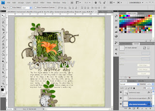
My garden is a riot of color in June with hundreds of daylillys blooming. It's something I look forward to each year and yesterday the first one bloomed. So, of course, I had to take a picture of it!! I was scrapping the picture using Jennifer's awesome new kit, 'Tomorrow's Another Day'. I had the LO almost finished, but it was missing something. The flower was such a bright orange, I thought the LO needed a little bit of orange, too. Here's what my layout looked like at first.

Now this kit, lovely as it is, doesn't have any orange. Problem? Nope! This is where we can "magically" turn an element from one color to another with, you guessed it, colorize! First, I had to decide where I wanted to add the "pop" of orange. I decided to use the flower centers. Since the button is included in the kit separately it was pretty easy to do. The first thing I did was use the color picker (eyedropper tool) to pick a shade of orange from the flower. When I pick a color like this, I'll usually add it to the color swatches until I'm done with the layout... it makes it easier sometimes. To better control the color I get, I also like to zoom in to the picture.
Ok, now that I had the color picked, it's time to load the button. I chose to use the tan button because I was looking for a softer orange. You can colorize the elment directly, but I'm a big fan of using adjustment masks. It makes undoing things much easier! Here I'm adding the mask. Make sure when the dialog box comes up to click on 'use previous layer to create clipping mask' or you could get some strange results!
When I added the mask, the foreground color turned gray. I don't know why, it does that, but it does. Don't worry about it. Okay, here comes the easy part. When the Hue/Saturation dialog comes up, click in the 'colorize' block.
Impressed yet? Neither was I. This color was a bit washed out. Now is when I had to tweak things to get just what I was looking for. I increased the saturation to 58 and, voila... perfection!
Well, almost perfect. You can see that the white string is tinted orange now. So, the last step is to fix that. I clicked on the layer mask and "erased" the part of the mask over the string with a solid black brush. Here's my recolored button.
The final step was to bring my recolored element into my layout and resize it to fit over the green one on the flower. Then I resized a few of the flowers, added some, and moved them around. Again and again. Here's the finished layout.
Well, the layout may not be totally finished yet, but it's finished for now. Tomorrow's another day!
The next time you're looking for the perfect color element to use on your layout, don't go searching through your stash... color one yourself! Happy scrapping!!


0 comments:
Post a Comment