Showing posts with label Saturday School. Show all posts

Saturday, May 14, 2011

Saturday School-Image Inside Text

Good morning scrappers, Kara here with today's Saturday school. I've been scrapping for 4 or 5 years now and I love learning new things. Last year I learned how to place an image inside my text, and now I'd like to share this with you.


1. Open a new image, make a new layer, and drag and drop a photo onto your canvas.
2. With the Text tool, click on the canvas and type your text. A bold, fat font works best. Pictured is Aharoni Bold, but there are many others that are similar. Here I added a Stroke Layer Style to give the letters a black outline.
3. If your text is on the layer above the image, move it below the image by clicking and dragging the Text layer thumbnail below the image in the Layers Palette.
4. To make the clipping mask, go to Layers>Create Clipping Mask, or type Ctrl-G, or Alt-Click on the line between the two layers in the Layers Palette.
5. Now resize your image to fit in the lettering better. Here I resized and duplicated the layer and moved it over to give more coverage. Remember to add the Stroke Layer Style to the text layer if you want an outline.

*Info from digitalscrapbookplace.com*

Read more...

Saturday, April 30, 2011

Photography Tips!~

Angie here....I am a little late with today's blog post, but better late than never!!! I wanted to share a few tips for taking some fun summer photos~

1. don't take photos in full sun...usually your subject is squinting and the sun is so harsh one side of your subjects face is completely white and one side completely dark
2. try to shoot on ISO 100/200 or 400 for full sun
3. the best time of day is to shoot early morning or late afternoon where you can get fabulous sunlight
4. concentrate your focus on your subjects EYES :)
5. for subjects running through a sprinkler or splashing in a pool use a higher shutter speed of 500 or more....this keeps your subject in focus!
6. don't be afraid to ZOOM in and have your subject's face fill the whole frame! some of these are the best shots I have ever taken!
7. if your camera tries to trigger the flash, turn it off and if you have to use a tripod~
8. find shade and just start shooting until you find just the right spot of light~
9. remember to play play and play with your camera....there is ALWAYS the DELETE button!
10. and ALWAYS try to have a spare battery/batteries, memory card and cleaning cloth handy :)

look at the examples below that I took today of my girls...the sun was VERY harsh it was around noon time so I found a nice shady spot and just started shooting...then I moved in closer! and then I just love that they like to get goofy...so don't worry about everybody looking at the camera, just shoot them in their natural setting, you will be amazed at what you get :)


Read more...

Saturday, April 16, 2011

Saturday School: Photo Blends

Hi Everyone!!!  Its Jenn (jk703) here to stop in for a Saturday tutorial!  Can't wait to get started!

First... Have you seen BLOOMFEST?!  O Mi Gosh... I went over and didn't know where to look first!  Here is Jen's awesome Just For Fun Grab Bag... which by the way, is such a steal!  Check it out!

I was asking the girlies on the CT what they themselves wanted to learn, and a suggestion was a photo blend.  This type of blend is the one where you will see a photo blended into the background paper!  So here we go.... but remember - there are so many ways to do this little technique!  This is my own take on it, and a pretty simple one too!

First, open a blank document, a plainish background paper to practice on and a copy of a photo.  When I am working on something, I save it with the title Working Copy, this way I know what I am working on, and can title it will all my used products at a final save.  

I've used Jen's Grab Bag - Just For Fun Tinted Krafties for my example. The picture is my son crusing around on a small quad, and not crashing!  :)

Place your background paper, and then the photo on top.  When placing your photo, place it where you would like the main part of the image to remain.  Here is how I placed mine: 


Now... on the Layers Palette, with the photo selected, you can scroll through the different Blend Modes that are available to you in PS or PSE. 

TIP:  To "see" what all the blend modes look like with your picture is to do this:  Choose the layer that will be blended in the Layers palette.  Now, press the Shift key, and use your + and - keys to "scroll" through the different blend modes. How easy and cool is that?!  


I really liked the Luminosity blend mode and I also liked the Linear Burn, and Multiply.  Look at them all though - each picture will have a different effect determined by the background paper you choose as well as the picture itself.  Here is the Luminosity blend mode:


And here is what my Layers Palette looks like - yours should look similar. I also changed the Opacity of my photo so it was a view that I liked. It is at 55%. 


After the photo blend mode is complete, you will now "erase" part of your picture.  Choose the eraser tool, and make sure it is in Brush Mode. You want to have a soft brush, and you can play with the opacity for your erasing.  For my picture, I used an Eraser opacity of  about 65% and my brush was about 500 pixels. 


Next, you will begin to erase your photo.  Go slowly, and first stick to the edges. Gradually go over the harsh square/rectangular edges of your photo.  Move closer into the subject and get as close as you like.  Make it visually appealing to you!  Here is mine:


Guess what!?  That is it!  You thought it was a lot harder, right!?  So did I until I learned how!  But wait... you can do more.... Say you want to mix up the look.  Duplicate your finished blended photo, and then try additional blending modes and opacities!  Here is one that I just plain duplicated the image and put the blend mode on Multiply.


And here is one where I duplicated the blended image, the first layer uses the Luminosity Blend Mode and for the second image, I chose the Color Blend Mode. 


There you have it... and easy way to do a quick blend of a photo into a background paper!  Hope that you liked it!  If you would like to learn a specific technique, just comment here and I be happy to make a tutorial up!  I would get to learn something too!

Happy Saturday and Go check out Bloomfest!  
Jenn
(jk703/The Typative Scrapper)

Read more...

Saturday, April 2, 2011

Saturday School: Tips for Scanning

Hi Everyone!  Jenn (jk703) here to share a few tips with you!  So happy it is Saturday!  The end of the month is always a lot of work for me so I'm planning to get my scrap on this weekend and relax!

I'm sure that you are like me... you have so many pictures to scrap, but there is a part of you that wants to scrap the past... pictures that are not digital.  I've been thinking about putting together an album for my parents about their own parents.  I want to record things about my grandparents from THEM, and then share it with my parents.  I think it would be a treasure for when they are not around.  So, you have all these old pictures - what to do?  Buy, borrow or steal... ok, no stealing please... a scanner and get it all hooked up. There are a few guidelines when scanning pictures, memorabilia, negatives or most anything so that you can get the best scans possible.

Top Scanning Tips:


Cleanliness
Keep it clean, the glass, scanner itself, and the area around your scanner.  Dirty areas lead to dirt on the scanner glass, which in turn leaves problems with your scanned images. Check the items that you are scanning for dirt, lint, and smudges.  This will help when you edit the images later on.

Positioning
Carefully smooth away any creases, and bent areas to prevent a skewed area or distortion of the scanned image. Place your image face down on the glass, and position it as the scanner indicates.  Most scanners have a preview button.  Run the preview to see what it will look like.  Re-position as necessary. You want to look to see if the photo is straight, no smudges or lint, and to make sure that you got the whole image.

Scan Resolution and Storage
You will need to determine what resolution you want to scan your items.  The best resolution will depend on how you will use/save the image. Whether they will be printed, saved, or displayed needs to be determined before scanning. A good rule of thumb is to scan your photos at a minimum of 300dpi to really get a decent quality, or 600dpi or greater is even better for storing these images on CD or DVD. Check that you have ample space to store your images... a 4x6 image at 300 dpi is about 5-6 MB.

Edit: After
There are so many things that you can do to photos nowadays, that you should scan the image or item in without making any corrections before or during the scan.  The rule of thumb about scanning is that you Scan, Save, Play.  Scan your image in, save your image, and then tweak your image.  You can adjust brightness, contrast and all the other little edits after it is scanned and saved.  Scan in original format.. and color... you can go from color to black and white, but it is much harder to restore the color later on down the road.

Back Up
Save your images, and then back them up in another location other than your hard drive.  You will thank yourself the day you start having computer problems. Simple and so effective.


I hope you can go and pull out some old images and scan them in.  I'm going to pester my grandparents for pictures of them as kids and growing up, as well as pictures of my parents!
If you have any questions, let me know.  I'll be sure to help you out!  Have a great Saturday everyone, and thanks for stopping by!

Jenn
(jk703/The Typative Scrapper)

Read more...

Saturday, March 26, 2011

Saturday School: Option to Edit & Organize - Photo Software

Hi Everyone!  It's Jenn (jk703) here to share some information with you today for saturday School!  We are going to go over some software options that are available for photo editing and organization!

I know... you are looking at your scrapbooking stash and wondering if there is something out there to help you find things, sort images, and edit images, making it all pretty and tidy, right?! I bet you even started digital scrapbooking, and thought "This is going to be so much more organized than paper scrapping!"  Right!?!  HA!  Now, you've probably been scrapping for a bit, have a gigantic un-countable amount of un-edited photos and then on top of that an amazing stash of digi supplies!

What to do? What to do?  Well.... I'm going to share some software that either is for photo organization, photo editing or has the capabilities included. Depending on your type of computer, budget and what options you are looking for - there is something for everyone!

 Picasa is by Google.  It is a free download that will allow you a simple way to organize your photos.  This option also allows for simple photo editing, such as lighting and color issues. They offer batch uploading, and also allows you to see the photo properties.  You can see what settings you had on the camera when you took a certain photo. They support tagging, search filters, and color searches.


Adobe Photoshop Elements is not just for creating, but can be used for the organization of your photos and supplies. This is available on all Windows versions of PSE, and then only on
PSE 9 for Mac versions. The organizer lets you organize your photos with keyword tags, then search and share them.  Quick fix allows you to crop, fix red eye, and sharpen  - but there is much more.  Cost can be from $50 to $100.
Adobe Bridge comes with the certain Adobe programs or Creative Suites.  It offers a folder based system of organization.  This software would streamline your photo editing, creative workflow, and actually using your photos because it works directly with Photoshop.  Allows sorting, filters, batching, color labels, star ratings, and some drag and drop features.  Cost:  Software comes with certain Adobe software, so the price can vary. 
Acdsee is an easy to use photo organizer, editor, and sharing machine.  Browse, organize, and manage all your photos and supplies in one location.  Create your own categories, keywords, key phrases, and much more.  There are also editing tools included, such as exposure correction, red eye fix, and it also includes some creative effects. Cost:  $70 - $170.00 depending on the version. 


Adobe Photoshop Lightroom is more of a photo editing software than an organizer.  It isn't a file browser like Adobe Bridge, but more of an image management system with heavy duty photo editing. The organization part of Lightroom reminds me of the Photoshop Elements Organizer.  You can use keywords, and locate things by color, or type.  Cost:  $250-$300. 

iPhoto is a software that is included in iLife, on Apple computers. This just happens to be how I ended up organizing.  The software allows for events, merging, separation as well as keywords, smart albums and search functions.  You can create separate photo libraries, such as one for photos and one for digital scrap supplies.  This software has really basic photo editing options.  Cost:  $49 - $79, to purchase iLife software.

Have a great Saturday everyone!
Jenn (jk703/TheTypativeScrapper)

Read more...

Saturday, March 19, 2011

Saturday School - Printing Layouts

Happy Saturday everyone! Terra here with another Saturday School topic for you. Now that I have created quite a few layouts I have started to research my options for printing. Once you decide the size you want to print (often 12"x12" or 8"x8"), there are generally two options - printing professionally bound photo books or printing single pages and adding them to an album.


Photo books are great for a commemorating a special event or if you are a chronological scrapbooker. I know I would love to create a wedding photo book and a book to celebrate my baby's first year, just to name a few! But for the most part, I am not a chronological scrapbooker so photo books intimidate me and I have been looking for other solutions.

I really like the idea of creating albums similar to the albums that traditional scrapbookers create. They look very durable as printed pages are protected by page protectors and pages can be reorganized whenever necessary. There are a variety of albums on the market with different covers and binding options to suit anyone's needs. There are traditional D-ring binder albums that are simple to use if you add/remove pages frequently. Expandable post-bound albums can be more time consuming to add/remove pages because you have to take the album completely apart to reorganize pages. I have heard that you can make this process easier by replacing the metal posts with a product called snaploads.
Classic 12x12 D-ring binder from We R Memory Keepers

As for vendors, I have heard a lot of good things about Persnickety Prints. I honestly can't remember hearing anything negative about their quality or service. They offer single prints, photo books, calendars and more.They currently have a deal on Facebook for 25% off of 12x12 prints. But hurry, the deal is only available to the first 300 customers.

Of course you may remember that Jennifer did a review on Lulu photo books a little while ago. If you missed it, you can check out her review here. Jennifer was very impressed with her photo book and gave them a great review.


Page from Jennifer's Lulu Photo Book

Shutterfly is another great option for either photo books or prints and if you take the time to look for deals you can often find a coupon on the web for a low priced photo book.

I hope that you have enjoyed this Saturday School post. Let me know what you thought of it in the comments. Do you print photo books or single pages? Have you used other vendors for printing your layouts?

Read more...

Saturday, March 12, 2011

Alpha Outline: How To

Hi Everyone!  Hope you are having a great Saturday!  It's Jenn (jk703) here to share a little tutorial to add a little something to all those fonts you use on your layouts!  I'm sure many of you are fontaholics just like me!

Many times on a layout, I will use an alpha for a main word in my title, and then use a font the other words that are in the title.  BUT, there are also times when I just use fonts for my whole title.  Outlining the font gives it a little oomph and makes it stand out a little.  It can look like a sticker, or just give the font an different look.

For my example, I am using He's My Brother kit, and the font is called Smiley Monster, a free scrapbooking font by Kevin and Amanda.  An awesome color palette, and lots of fun embellishments!


Ok... let's get started!  You should have a layout open in PS or PSE.

Using the Type Tool, choose your font, and type in your title or the words that you will be outlining.

Double check the font, spelling, and placement to make sure it is how you want it to look.

Next, you will right click on the Type Layer in the Layers Palette.  Choose Rasterize layer or Simplify Layer, depending on your program.


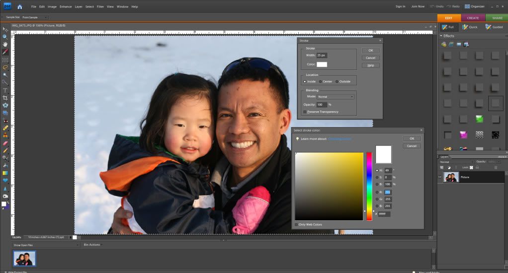
In the File Menu, click on Edit > Stroke, and the Stroke menu will pop up.

I usually use anywhere between 2 and 8 pixels.  If you want a larger stroke outline, you can always adjust the distance between letters to allow for more space. 


Another way to change it up is to play with the stroke color, with different colors used to match my layout. In the Stroke menu, the Color box is clickable, and the Select Color Menu will pop up so you can choose any color you want.


Remember, you can play with all the settings here, to see what pops up.  If you don't like what you did, click to undo!  I first tried a brown outline as seen here.

Next, I tried teal, and last I tried White.  White on white is nice, just add a shadow to really show off the edges as if it was a sticker.


There you have it... a nice outline to my title with a font!  It looks like a sticker with the edge, and then the added shadow gives it some depth!  Hope you enjoyed the tutorial!  Thanks for visiting!

Enjoy the rest of your weekend!
Jenn (aka jk703 or The Typative Scrapper)

Read more...

Saturday, March 5, 2011

Saturday School - Adding a Border to Photos

Adding a Border to Photos or Elements in PSE

Hey Everyone!!  Michelle (aka mdel) here with a tutorial for y'all.
Have you ever wanted to add a border to a photo or element to help
give it a little pop?  From time to time I find myself adding an
alpha to one of my layouts only to notice that it is getting
a bit lost on the page.  Today I thought I'd share an easy tutorial for adding a border
around a photo, element or alpha.
Let's get started...

To begin, open Photoshop Elements and a photo.  I currently use PSE 7.0 but I have used
this technique in PSE 5.0 as well.  Make sure your layers palette is visible.  If the
palette is not visible go to Window>Layers which will open the layers palette.

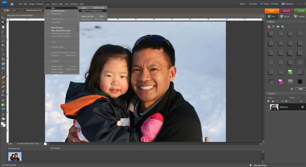
Next click on Layer>New>Layer from Background.


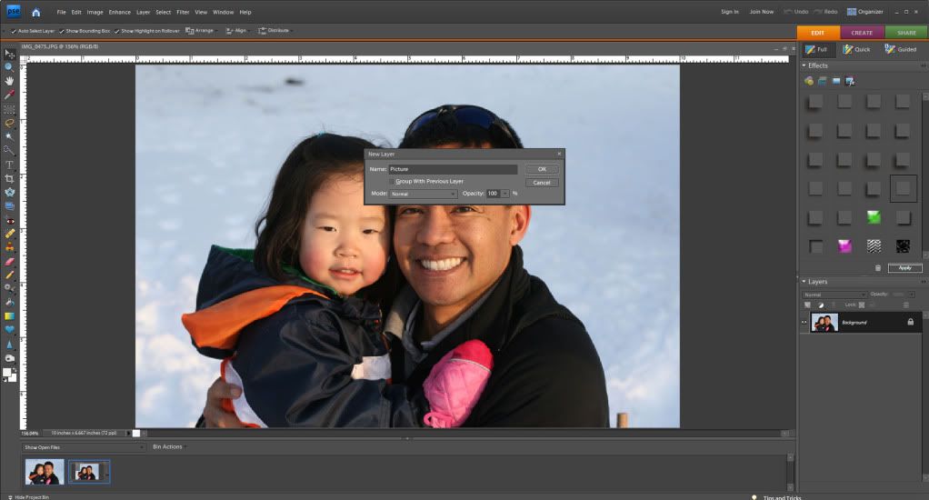
You can now give your photo layer a name (doesn't really matter what you choose)
and then click "ok" to close the dialogue box.


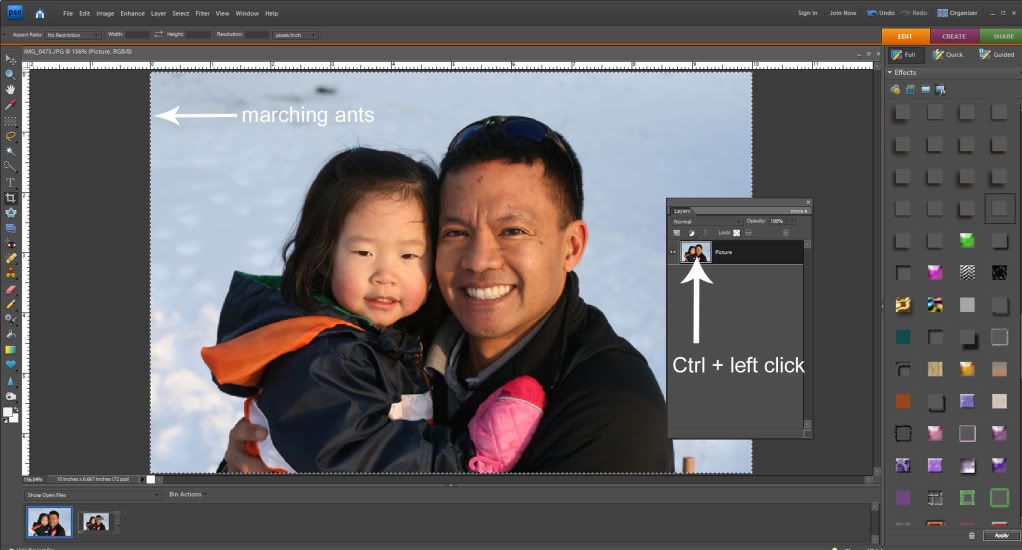
Hold down the Control (Ctrl) key and left click your mouse on the photo
layer icon in your layers palette.  This will bring up what are referred to
as "marching ants" around the edge of your photo.


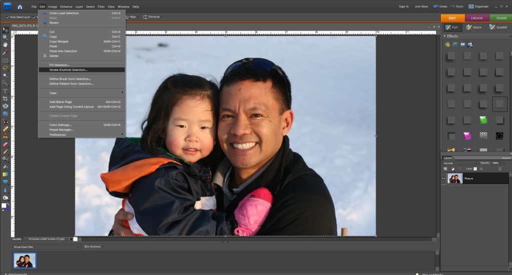
Click on Edit>Stroke (Outline) Selection


Once you do this your Stroke dialogue box will pop open. The width box controls
how wide your border will appear on your photo or element.  (When adding a border to
a photo I usually use about a 25 px setting. If I am adding a border to an alpha or
element I may make it smaller.)  If you click on the color box a window opens
that will allow you to select the color of border you want to use. For photos, I like white or
off white however for elements or alphas you may want to use a color matched to the kit.
I leave my Location checked as "Inside", keep the Blending Mode at Normal and leave the
Opacity at 100. Once this step is complete click "ok" to close the stroke dialogue box.


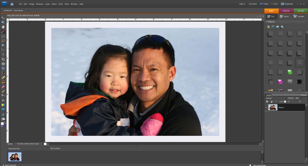
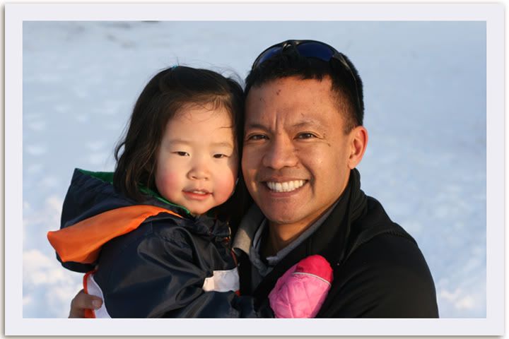
Upon clicking "ok" you should now see a border around your photo.


You may notice you still have the "marching ants" around your photo.  To remove those
click Ctrl+D.


Hope you found this tutorial easy and informative.  Happy Scrapping!!

Read more...

Friday, February 25, 2011

Saturday School - Flipping Elements

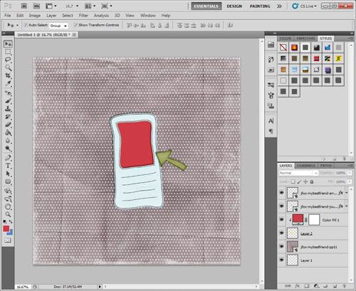
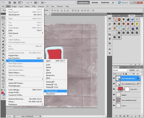
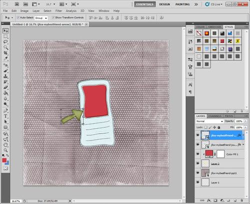
Happy Saturday, everyone! Terra here with a Saturday School tutorial for you on how to flip a page element. It is so easy to manipulate elements to make them work on your layout. It is an easy adjustment, but if you haven't done it before, you may not know where to begin. I have been digital scrapbooking for several months now but only took the time to learn this technique this week and thought I would share it with you. In this example, I am using Photoshop CS5 to flip an arrow in Jennifer's new kit, My Best Friend, available at Ninth and Bloom.
  1. Place the element on your page.
  2. Select the element.
  3. Go to Edit > Transform. There are several options listed, including options to rotate or flip the selected layer. In this case, I selected Flip Horizontal to flip the arrow the opposite direction.
  4. Move the element to place it in any position on the page and you are done.
This is a quick and easy transformation to make to any element in a kit. Now that you know how to flip an element, take some time to play with some of the other ways you can manipulate elements on a layout, such as rotating 90 or 180 degrees.

Have a great weekend!

Read more...

Saturday, February 19, 2011

Saturday School: Brush Tool Info

Hi Everyone!  Hope your Saturday is going great!  I'm here today to share more information about the Brush Tool in Photoshop.... but before I do...

Can you believe the news?  Jennifer Fox Designs is now at 9th and Bloom!!  Woot!  How cool is that!?  I hope you've stopped over there, checked out her goodies in the store!  You might also want to stop here and see how you can win a chance to join the Creative Team for 3 months!  Good Luck!

About the Brush Tool and the Options

First, you need to start a new document, layout or an existing project. You will select the Tool Brush from the tools toolbar.  This is what the Brush Tool is, and what other tools are available.


The Options Palette on the top looks like the picture below... and is pretty easy to use. You can change the size of the brush, as well as play with the hardness of the brush that you will use. When you change the number of pixels of a brush, you are changing the Hardness.  A higher number on the Hardness slider will make the edges on your brush more defined.  A lower number on the Hardness slider will make the edges on your brush less defined.


On the Options palette you can choose the Mode that you want the brush to have, the actual stroke.  The Opacity percentage will change the opacity of the brush stroke. Lowering the percentage will make the brush stroke more transparent, while raising the percentage will make it less transparent.

There is also a button for Flow.  This allows you to select how much paint will come out of the brush when applied to your document. The higher the flow, the more paint, as well as the lower the flow, the less paint used when you click your mouse.

There is also an Airbrush feature available. This allows paint to come out of the brush the whole time you are moving your mouse.

If that isn't enough to learn... there is a whole nother menu under the brush presets. This is what that menu looks like:  


There are a lot of setting here, but many are pretty self explanatory -- as long as you play with them, try them out, and experiment. Here are some of the options in this menu:
  • Brush Tip Shape -- determines the main shape of the brush. 
  • Shape Dynamics -- allows you to modify the shape of the brush.
  • Scattering -- this option determines how closely the brush marks are to the stroke. This can add a nice randomness to your stroke. 
  • Texture -- Adding a texture to your brush can really show some depth. Photoshop allows you to apply any of your Texture presets to your brush. 
  • Dual Brush  -- Combining two different brushes using the Dual Brush option can really create some fantastic effects - unavailable if you were only using one brush. 
  • Color Dynamics  -- this option allows for modification of the color of the stroke.  Playing with this will allow you to create some interesting color variations.  
  • Noise -- Creates random noise within your brush shape.
  • Wet Edges -- If you keep the edges of your brush at the highest opacity, and lowering the inside of your brush's opacity will create a similar look to watercolor, hence the Wet Edges.
  • Airbrush -- works with Flow, that is on the Menu bar above. 
  • Smoothing -- Smoothes the curves of the stroke.
  • Protect Texture -- This can allow you to make sure the same texture is used for every brush with a texture.
Brush Tool Shortcuts:
  • B -- Brush Tool
  • Shift + B -- Rotate through Brush tools (i.e. Brush, Pencil, etc)
  • F5 -- Show or hide Brushes palette
  • [ -- Decrease brush diameter
  • ] -- Increase brush diameter
  • Shift + [ -- Decrease brush hardness by 25%
  • Shift + ] -- Increase brush hardness by 25%
  • , --  Previous brush
  • . --  Next brush
  • Option (hold) --  Temporarily switch to Eyedropper tool
  • Shift + Option (hold) -- Temporarily switch to Color Sampler tool
  • Command (hold) -- Temporarily switch to Move tool
  • Command + Option (hold) -- Duplicate and Drag layer
  • Space (hold) -- Temporarily switch to Hand tool
Now for something quick to teach you a fun way to use the tool!  We are going to add some really basic watercoloring to a paper.  I've used a piece of paper from Jennifer's Tomorrow's Another Day Kit to show off my example. 

First, you will open the paper in a separate document and apply the shadow style you would like. Next... Command and Click on the Notebook Paper, so you see the marching ants. 

Click on Layer > New > Group. Then click on Add a Layer Mask, which is this little button
on the layers Palette. Create a new layer above the notepaper. 


First, I am going to select the Pencil Tool within the Brush tool, change the opacity to 30% on the menu bar options, and make my brush size about 125 pixels.  Drag your cursor over the paper to areas you want to add watercolor to. This is brown added:


Next, I did the same technique, changed up the opacity and brush sizes, and added faint Pink and Green layers.  I also played with the blending modes of each color layer.  My favorites are Multiply, Linear Dodge, Linear Burn... you have to play with them all!  Here is what I ended up with. 


Now, think of what you could add... doodles, coffee stains, textures, splatters... so much more! I've only barely touched what the Brush Tool is all about or what it can do!  I hope that you might have learned something today!  


Thanks for visiting!
Jenn (aka jk703/The Typative Scrapper)

Read more...
Related Posts with Thumbnails

Disclaimer

As a creative team member for several digital scrapbook designers, I have received their products for free in return for creating and posting projects (digital layouts, hybrids projects, etc). Many of the layouts you see here were done in conjunction with requirements for these creative teams. Please be advised that the products used were indeed received for free.
The Daily Scrapper - Topsites Best Scrapbooking Sites, Digital Scrapbooking, Scrapbook Supplies, Reviews, Awards
List of the Best Digital Scrapbooking Websites by Scrapbook MAX!SCRAPBOOKING TOP 500 The Daily Scrapper - Topsites Free Digital Scrapbooking

  © Blogger templates Newspaper III by Ourblogtemplates.com 2008

Back to TOP