Showing posts with label Tutorial. Show all posts

Sunday, May 8, 2011

Scissors Sunday - Hybrid Project

Happy Mother's Day to all of the Mom's out there.  I hope you are enjoying some time with those you love. 

For today's Scissors Sunday post I thought I would share a little project I put together this week for my son's teachers in honor of Teacher Appreciation Week.  Who doesn't love chocolate, right?  As a small token of our gratitude I created a candy bar wrapper using Jennifer's kit:  Bloom

along with her contribution to the blog train: iNSD Freebie Alpha


Here's is what I came up with after using some ribbon and flowers I had on hand.....


Enjoy your day!!!

Read more...

Saturday, April 16, 2011

Saturday School: Photo Blends

Hi Everyone!!!  Its Jenn (jk703) here to stop in for a Saturday tutorial!  Can't wait to get started!

First... Have you seen BLOOMFEST?!  O Mi Gosh... I went over and didn't know where to look first!  Here is Jen's awesome Just For Fun Grab Bag... which by the way, is such a steal!  Check it out!

I was asking the girlies on the CT what they themselves wanted to learn, and a suggestion was a photo blend.  This type of blend is the one where you will see a photo blended into the background paper!  So here we go.... but remember - there are so many ways to do this little technique!  This is my own take on it, and a pretty simple one too!

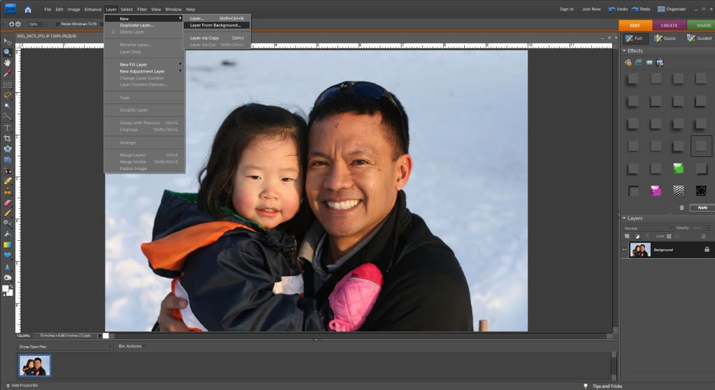
First, open a blank document, a plainish background paper to practice on and a copy of a photo.  When I am working on something, I save it with the title Working Copy, this way I know what I am working on, and can title it will all my used products at a final save.  

I've used Jen's Grab Bag - Just For Fun Tinted Krafties for my example. The picture is my son crusing around on a small quad, and not crashing!  :)

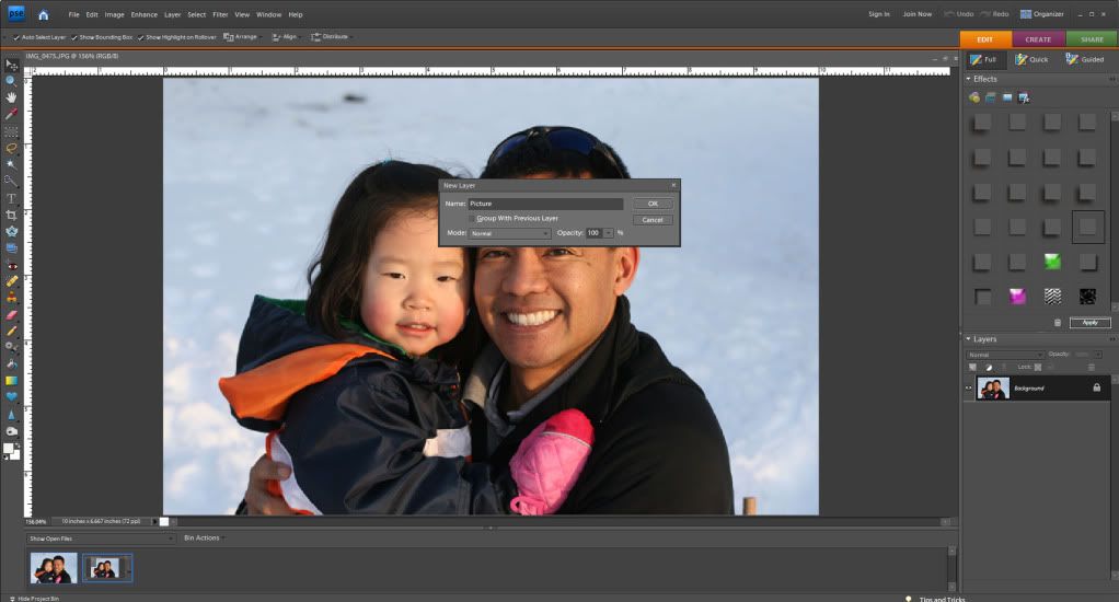
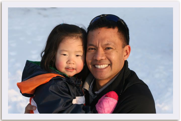
Place your background paper, and then the photo on top.  When placing your photo, place it where you would like the main part of the image to remain.  Here is how I placed mine: 


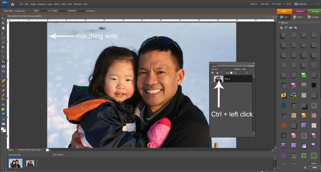
Now... on the Layers Palette, with the photo selected, you can scroll through the different Blend Modes that are available to you in PS or PSE. 

TIP:  To "see" what all the blend modes look like with your picture is to do this:  Choose the layer that will be blended in the Layers palette.  Now, press the Shift key, and use your + and - keys to "scroll" through the different blend modes. How easy and cool is that?!  


I really liked the Luminosity blend mode and I also liked the Linear Burn, and Multiply.  Look at them all though - each picture will have a different effect determined by the background paper you choose as well as the picture itself.  Here is the Luminosity blend mode:


And here is what my Layers Palette looks like - yours should look similar. I also changed the Opacity of my photo so it was a view that I liked. It is at 55%. 


After the photo blend mode is complete, you will now "erase" part of your picture.  Choose the eraser tool, and make sure it is in Brush Mode. You want to have a soft brush, and you can play with the opacity for your erasing.  For my picture, I used an Eraser opacity of  about 65% and my brush was about 500 pixels. 


Next, you will begin to erase your photo.  Go slowly, and first stick to the edges. Gradually go over the harsh square/rectangular edges of your photo.  Move closer into the subject and get as close as you like.  Make it visually appealing to you!  Here is mine:


Guess what!?  That is it!  You thought it was a lot harder, right!?  So did I until I learned how!  But wait... you can do more.... Say you want to mix up the look.  Duplicate your finished blended photo, and then try additional blending modes and opacities!  Here is one that I just plain duplicated the image and put the blend mode on Multiply.


And here is one where I duplicated the blended image, the first layer uses the Luminosity Blend Mode and for the second image, I chose the Color Blend Mode. 


There you have it... and easy way to do a quick blend of a photo into a background paper!  Hope that you liked it!  If you would like to learn a specific technique, just comment here and I be happy to make a tutorial up!  I would get to learn something too!

Happy Saturday and Go check out Bloomfest!  
Jenn
(jk703/The Typative Scrapper)

Read more...

Sunday, April 10, 2011

Scissors Sunday - Delight in Life

Hi all, Sarah here with another quick and easy hybrid project for you. For this post I took Jennifer's new and decidedly emo kit One of Those Days and created an uplifting card. I love the bright pinks and greens in the design and wanted to make something fun and simple to share with you.

I totally love the paint splatters included in the kit and decided these would be my jumping off point. I added one of the paint splatters to my page and also decided to add a strip of the green background paper to mat the paint splatters. I then printed this page onto presentation paper.


Next comes the card. I began by using my ruler tool to divide the page into quadrants (center lines are 4.25" horizontally and 5.5" vertically). I decided on my sentiment and created it using two fonts (Holiday Springs BTN which came with my scrapping software and The Typewriter by Heather Hess). I then eyeballed my placement in each of the top quadrants so that I will be able to create two A2 sized cards (one sheet of 8.5" x 11" cardstock, cut in half and folded creates an A2 card). I printed this on plain white cardstock.


For this project I used these tools. My paper trimmer, a bone folder and double sided adhesive tabs. If you have small square punches you could definitely use these to punch the squares out and make it easier. The bone folder is optional but I find that it helps give my cards a nice crisp folded edge.


To create my decorative accents I began by cutting my green paper into 3/4" squares. Then I cut the paint splatters into 1/2" squares. You can definitely play with the sizes to create a bigger or smaller mat or bigger or smaller accents depending on your tastes. Here's a close up of the finished squares.


And here's the finished cards. These probably took me about 10 minutes to create start to finish so it's a really great way to make a personal card in a short amount of time.

I hope you enjoyed this tutorial. If you have any questions please post in the comments section. Thanks so much for stopping by!

Read more...

Sunday, March 20, 2011

Scissors Sunday: Faux Stitching

Happy Scissors Sunday everyone!  Jackie here with a little tidbit about how to get that stitched look to your hybrid projects without ever having to lift a needle or thread.  I use it on occasion and I like the way it looks.

I created this card using Jennifer's "My Birthday Boy" kit which is available at 9th and Bloom.  For the lighter tan colored strip, I used Jennifer's "My Best Friend" kit.  After I printed off the papers and cut them out, I added some white stitching with a white craft marker.  You can use any color marker you'd like, of course!  I did it completely free hand, but you could use a ruler to keep your lines straight if you want.


A closer view (as you can see they aren't perfect, but I feel it gives a little bit more personality to the card!):
Full credits:
My Birthday Boy, My Best Friend - Jennifer Fox Designs
Stickles, Ribbon from Michaels, Button from Paper Trey Ink, Adhesive
SSSC109

Thanks for stopping by today! 

Read more...

Saturday, March 12, 2011

Alpha Outline: How To

Hi Everyone!  Hope you are having a great Saturday!  It's Jenn (jk703) here to share a little tutorial to add a little something to all those fonts you use on your layouts!  I'm sure many of you are fontaholics just like me!

Many times on a layout, I will use an alpha for a main word in my title, and then use a font the other words that are in the title.  BUT, there are also times when I just use fonts for my whole title.  Outlining the font gives it a little oomph and makes it stand out a little.  It can look like a sticker, or just give the font an different look.

For my example, I am using He's My Brother kit, and the font is called Smiley Monster, a free scrapbooking font by Kevin and Amanda.  An awesome color palette, and lots of fun embellishments!


Ok... let's get started!  You should have a layout open in PS or PSE.

Using the Type Tool, choose your font, and type in your title or the words that you will be outlining.

Double check the font, spelling, and placement to make sure it is how you want it to look.

Next, you will right click on the Type Layer in the Layers Palette.  Choose Rasterize layer or Simplify Layer, depending on your program.


In the File Menu, click on Edit > Stroke, and the Stroke menu will pop up.

I usually use anywhere between 2 and 8 pixels.  If you want a larger stroke outline, you can always adjust the distance between letters to allow for more space. 


Another way to change it up is to play with the stroke color, with different colors used to match my layout. In the Stroke menu, the Color box is clickable, and the Select Color Menu will pop up so you can choose any color you want.


Remember, you can play with all the settings here, to see what pops up.  If you don't like what you did, click to undo!  I first tried a brown outline as seen here.

Next, I tried teal, and last I tried White.  White on white is nice, just add a shadow to really show off the edges as if it was a sticker.


There you have it... a nice outline to my title with a font!  It looks like a sticker with the edge, and then the added shadow gives it some depth!  Hope you enjoyed the tutorial!  Thanks for visiting!

Enjoy the rest of your weekend!
Jenn (aka jk703 or The Typative Scrapper)

Read more...

Saturday, March 5, 2011

Saturday School - Adding a Border to Photos

Adding a Border to Photos or Elements in PSE

Hey Everyone!!  Michelle (aka mdel) here with a tutorial for y'all.
Have you ever wanted to add a border to a photo or element to help
give it a little pop?  From time to time I find myself adding an
alpha to one of my layouts only to notice that it is getting
a bit lost on the page.  Today I thought I'd share an easy tutorial for adding a border
around a photo, element or alpha.
Let's get started...

To begin, open Photoshop Elements and a photo.  I currently use PSE 7.0 but I have used
this technique in PSE 5.0 as well.  Make sure your layers palette is visible.  If the
palette is not visible go to Window>Layers which will open the layers palette.

Next click on Layer>New>Layer from Background.


You can now give your photo layer a name (doesn't really matter what you choose)
and then click "ok" to close the dialogue box.


Hold down the Control (Ctrl) key and left click your mouse on the photo
layer icon in your layers palette.  This will bring up what are referred to
as "marching ants" around the edge of your photo.


Click on Edit>Stroke (Outline) Selection


Once you do this your Stroke dialogue box will pop open. The width box controls
how wide your border will appear on your photo or element.  (When adding a border to
a photo I usually use about a 25 px setting. If I am adding a border to an alpha or
element I may make it smaller.)  If you click on the color box a window opens
that will allow you to select the color of border you want to use. For photos, I like white or
off white however for elements or alphas you may want to use a color matched to the kit.
I leave my Location checked as "Inside", keep the Blending Mode at Normal and leave the
Opacity at 100. Once this step is complete click "ok" to close the stroke dialogue box.


Upon clicking "ok" you should now see a border around your photo.


You may notice you still have the "marching ants" around your photo.  To remove those
click Ctrl+D.


Hope you found this tutorial easy and informative.  Happy Scrapping!!

Read more...

Friday, February 25, 2011

Saturday School - Flipping Elements

Happy Saturday, everyone! Terra here with a Saturday School tutorial for you on how to flip a page element. It is so easy to manipulate elements to make them work on your layout. It is an easy adjustment, but if you haven't done it before, you may not know where to begin. I have been digital scrapbooking for several months now but only took the time to learn this technique this week and thought I would share it with you. In this example, I am using Photoshop CS5 to flip an arrow in Jennifer's new kit, My Best Friend, available at Ninth and Bloom.
  1. Place the element on your page.
  2. Select the element.
  3. Go to Edit > Transform. There are several options listed, including options to rotate or flip the selected layer. In this case, I selected Flip Horizontal to flip the arrow the opposite direction.
  4. Move the element to place it in any position on the page and you are done.
This is a quick and easy transformation to make to any element in a kit. Now that you know how to flip an element, take some time to play with some of the other ways you can manipulate elements on a layout, such as rotating 90 or 180 degrees.

Have a great weekend!

Read more...

Sunday, February 20, 2011

Scissors Sunday - Tiled Card

Hi all, Sarah here and I want to share one of my absolute favorite techniques to use on a card. I used it fairly often as a rubber stamper and think it works well in the world of hybrid as well.

The card I'm sharing today is really a fairly simple card. I started by opening an 8.5"x11" canvas. First I decided on a background paper. I make my cards A2 size so the purple background here is sized 5.25"x4". I then decided I wanted to use this cute topsy turvy cake as my main image for the card so I layered it on a paper (2.5"x5" in this case but a lot will be dependent on the image you choose) that would contrast with my background paper and the image of the cake (I also wanted to note that I used no shadows on the cake, I wanted to make it look like it was a part of the paper). The last thing I included on my canvas was a word stip that says happy birthday.


Once I printed my project I cut out all the elements, the background paper and the paper with the cake image with my paper trimmer. I just used my fine tipped scissors to cut out the happy birthday sentiment, but you could definitely use a craft knife as well if you are more comfortable with those.

Next I began cutting .5" strips widthwise and then slicing those sections into 1" strips, making sure to lay them out in the correct order as I cut them (note that since my paper was 2.5" there are some .5" squares...I just switched up the sides that the smaller cut was on so that I could do a offset brick look to my image)


I started building in the center, since I had 9 rows I grabbed the first tile in the fifth row, found the center of my background paper and glued it down. I built off of this original tile for the rest of the image.


Here's the card on an A2 card (I love this size since you can make 2 out of a standard sheet of 8.5"x11" cardstock) made with kraft cardstock. I love the tiled look ( i even through in a few extra .5" pieces since my vision of the card changed as I was working on it..I love how it turned out so it's all good) and I think the wordstrip sentiment was just the right touch to finish off the card.

Another way to do a tiled card would be to do squares or rectangles that align, I especially love doing the squares vs the offset tiles for florals and food items because it reminds me of a backsplash in a kitchen that way. This technique also works really well for stamped images and there are lots of great digital stamps out there as well as brush sets you can use to stamp digitally.

Thanks so much for stopping by. If you decide to create a tiled card we'd love to see it. Have a great rest of your Sunday!

Read more...

Saturday, February 19, 2011

Saturday School: Brush Tool Info

Hi Everyone!  Hope your Saturday is going great!  I'm here today to share more information about the Brush Tool in Photoshop.... but before I do...

Can you believe the news?  Jennifer Fox Designs is now at 9th and Bloom!!  Woot!  How cool is that!?  I hope you've stopped over there, checked out her goodies in the store!  You might also want to stop here and see how you can win a chance to join the Creative Team for 3 months!  Good Luck!

About the Brush Tool and the Options

First, you need to start a new document, layout or an existing project. You will select the Tool Brush from the tools toolbar.  This is what the Brush Tool is, and what other tools are available.


The Options Palette on the top looks like the picture below... and is pretty easy to use. You can change the size of the brush, as well as play with the hardness of the brush that you will use. When you change the number of pixels of a brush, you are changing the Hardness.  A higher number on the Hardness slider will make the edges on your brush more defined.  A lower number on the Hardness slider will make the edges on your brush less defined.


On the Options palette you can choose the Mode that you want the brush to have, the actual stroke.  The Opacity percentage will change the opacity of the brush stroke. Lowering the percentage will make the brush stroke more transparent, while raising the percentage will make it less transparent.

There is also a button for Flow.  This allows you to select how much paint will come out of the brush when applied to your document. The higher the flow, the more paint, as well as the lower the flow, the less paint used when you click your mouse.

There is also an Airbrush feature available. This allows paint to come out of the brush the whole time you are moving your mouse.

If that isn't enough to learn... there is a whole nother menu under the brush presets. This is what that menu looks like:  


There are a lot of setting here, but many are pretty self explanatory -- as long as you play with them, try them out, and experiment. Here are some of the options in this menu:
  • Brush Tip Shape -- determines the main shape of the brush. 
  • Shape Dynamics -- allows you to modify the shape of the brush.
  • Scattering -- this option determines how closely the brush marks are to the stroke. This can add a nice randomness to your stroke. 
  • Texture -- Adding a texture to your brush can really show some depth. Photoshop allows you to apply any of your Texture presets to your brush. 
  • Dual Brush  -- Combining two different brushes using the Dual Brush option can really create some fantastic effects - unavailable if you were only using one brush. 
  • Color Dynamics  -- this option allows for modification of the color of the stroke.  Playing with this will allow you to create some interesting color variations.  
  • Noise -- Creates random noise within your brush shape.
  • Wet Edges -- If you keep the edges of your brush at the highest opacity, and lowering the inside of your brush's opacity will create a similar look to watercolor, hence the Wet Edges.
  • Airbrush -- works with Flow, that is on the Menu bar above. 
  • Smoothing -- Smoothes the curves of the stroke.
  • Protect Texture -- This can allow you to make sure the same texture is used for every brush with a texture.
Brush Tool Shortcuts:
  • B -- Brush Tool
  • Shift + B -- Rotate through Brush tools (i.e. Brush, Pencil, etc)
  • F5 -- Show or hide Brushes palette
  • [ -- Decrease brush diameter
  • ] -- Increase brush diameter
  • Shift + [ -- Decrease brush hardness by 25%
  • Shift + ] -- Increase brush hardness by 25%
  • , --  Previous brush
  • . --  Next brush
  • Option (hold) --  Temporarily switch to Eyedropper tool
  • Shift + Option (hold) -- Temporarily switch to Color Sampler tool
  • Command (hold) -- Temporarily switch to Move tool
  • Command + Option (hold) -- Duplicate and Drag layer
  • Space (hold) -- Temporarily switch to Hand tool
Now for something quick to teach you a fun way to use the tool!  We are going to add some really basic watercoloring to a paper.  I've used a piece of paper from Jennifer's Tomorrow's Another Day Kit to show off my example. 

First, you will open the paper in a separate document and apply the shadow style you would like. Next... Command and Click on the Notebook Paper, so you see the marching ants. 

Click on Layer > New > Group. Then click on Add a Layer Mask, which is this little button
on the layers Palette. Create a new layer above the notepaper. 


First, I am going to select the Pencil Tool within the Brush tool, change the opacity to 30% on the menu bar options, and make my brush size about 125 pixels.  Drag your cursor over the paper to areas you want to add watercolor to. This is brown added:


Next, I did the same technique, changed up the opacity and brush sizes, and added faint Pink and Green layers.  I also played with the blending modes of each color layer.  My favorites are Multiply, Linear Dodge, Linear Burn... you have to play with them all!  Here is what I ended up with. 


Now, think of what you could add... doodles, coffee stains, textures, splatters... so much more! I've only barely touched what the Brush Tool is all about or what it can do!  I hope that you might have learned something today!  


Thanks for visiting!
Jenn (aka jk703/The Typative Scrapper)

Read more...
Related Posts with Thumbnails

Disclaimer

As a creative team member for several digital scrapbook designers, I have received their products for free in return for creating and posting projects (digital layouts, hybrids projects, etc). Many of the layouts you see here were done in conjunction with requirements for these creative teams. Please be advised that the products used were indeed received for free.
The Daily Scrapper - Topsites Best Scrapbooking Sites, Digital Scrapbooking, Scrapbook Supplies, Reviews, Awards
List of the Best Digital Scrapbooking Websites by Scrapbook MAX!SCRAPBOOKING TOP 500 The Daily Scrapper - Topsites Free Digital Scrapbooking

  © Blogger templates Newspaper III by Ourblogtemplates.com 2008

Back to TOP