Wednesday, September 29, 2010

Hybrid Showcase Wednesday!

Hi all! Kiki here with a hybrid showcase for you! This week I'm focusing on some amazing cards that have been made with Jennifer's products. Check these out!

Here are a couple of projects from tettletop20 who used Funkalicous Fall by Jennifer Fox Designs and Nikki Epperson for this card.


And here she's made some really cute birthday cards using My Birthday Boy.

Here's a gorgeous project by scrappydonna. Look at the depth that she created on this page and what a beautiful mix of warm and cool tones using Splendiferious.


And finally, how sweet is this card? SylviaB used the beautiful Splendiferious by Jennifer Fox and Jenn Barrette for this card.


I know that you've got it in you to try and make a hybrid card. Why not check out Jennifer's products and see what you can create. If you do make a hybrid project, please be sure to link us up in the comments!

Thanks and have a great day!

Read more...

Tuesday, September 28, 2010

Tid Bit Tuesday: Thrifty Giving

Hi everyone!  Stefanie here...one of Jennifer's guest for the month of September.  As the month comes to an end, I'm sad that I have to leave her team but was so happy that she picked me to work with her wonderful goodies this month.  I also got a spot to post on the blog so that was exciting.  When I started thinking about what to post, I went through my blog reader to try to find something interesting and different to post for you all.  Then this morning I got this email that I subscribe to and it seemed perfect.  It's all about Thrifty giving.  With two kids in daycare, the recession and birthdays and holidays coming up....I am all about the thriftiness if I can swing it.  Here is a great website with some ideas for just that.  Enjoy!  And guess what you can use Jennifer's goodies to make these into hybrid goodies also! 

Thrifty Giving by ScrapNgal

Happy scrapping and hope the rest of your week goes smoothly!

Read more...

Monday, September 27, 2010

French Toast--My Fave!

I adore French Toast. Really. It's a problem. I could eat it every weekend and so could the kids. There are a million recipes out there, but this is my fave and is super quick and easy.


French Toast Recipe:
3 large eggs
3/4 cup milk or cream
2 teaspoons pure vanilla extract
1 teaspoon ground cinnamon
Slices of thickly sliced bread
Butter(for pan)
Powdered Sugar
Syrup (warmed)

In a large bowl whisk together the eggs, milk, vanilla, and ground cinnamon. Whisk for about 3-4 minutes until mixture is frothy. Melt a small pat of butter in a large frying pan (I prefer stainless steel over non-stick) on medium heat. Dip both sides of each slice of bread into your mixture. Fry the slices of bread until golden brown. I can usually fit 2 slices at a time into my pan--it saves time!

Serve with a dusting of powdered sugar and warm maple syrup. YUM!

Photo from hotrecipies4all.com

Read more...

Saturday, September 25, 2010

Saturday School: Tool Time

Hi Everyone! Happy Saturday! This is Jenn and I am bringing you your Saturday School today! A couple of times a month, I will be blogging about the different tools that you find in Photoshop Elements and Photoshop. I want to show you what your tools can do for you!

This week's topic for tools is the Move Tool! I know, I know... you are thinking "The Move Tool?!" I know it isn't physics, or rocket science, but we have to start somewhere, right?! The Move Tool is the most basic tool, and there are some hidden secrets! Let's see if I can show you something that you didn't know!

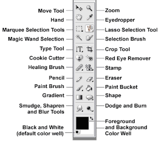
The Tools:


The move tool is at the top of the tools toolbar and looks like a triangle and a small arrow that points to the left. I actually learned a few tricks about the Move tool that I thought I would share! Some are basic... but keep reading! Click on the Move tool, or you can also get there by hitting "V" for the keyboard short cut and we are off...

You can move entire layers. If you first click on the layer (within the layers palette) to activate it. Then click onto the canvas and move the layer around as you would like or simply nudge it here and there using the arrow keys. A nudge is a a single pixel move in the direction of the arrow you choose. By pressing the shift key and the arrow, your nudge becomes a 10 pixel nudge!

To make copies of any image on layer, press and hold Alt key and drag the image with move tool. This action duplicates the image by creating new layer over original image layer.

To copy an object in a straight line, click and drag the object while holding down the Shift and Control (Command on a Mac) keys together. The element will be copied and the copy placed in a line either vertically or horizontally from the original element.

To find center point of any image, select move tool and check the move tool option "Show Transform Controls" on option bar above.

You can use the Move Tool temporarily while you are using most of the other tools - just by holding down the Control Key (Command on a Mac).


The option to Automatically choose the Selection is very handy. By checking this item, it allows a selection that is clicked on within the canvas to be moved. The corresponding layer in the layers palette will also be highlighted and selected.


The option to Show the bounding Box is important to me! By choosing this option, a 9 point box will show up around your selection. By choosing one of those nine points, you can click and drag to enlarge or shrink the selection. In the center of your selection is a round point, by clicking and dragging this, you can skew the selection.

When the Bounding Box is selected and you press the Control + T (Command + T on a Mac) the move tool will then change to the the Transform Command.

To quickly change the opacity of a layer quickly while you are using the move tool, type the percentage opacity you want the layer to be. Typing an 8 will change the opacity to 80%, typing 1 plus a 5 will change it to 15% but to change the opacity to 100%, you can just type a zero.

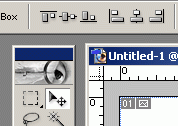
In the top of the bar that shows the Move Tools, within the sub tools, you should see this tool menu or something similar:
This part of the Move tool can be really, really useful! Aligning two layers together is all well and good, but we often find we want to align something to a specific layer. For instance, you might want to center a layer horizontally within another layer, or centering a frame on to a cropped background paper. Here's how:
  1. Control (or command) click on the icon in your layers palette. This makes the marching ants march around that particular selection.
  2. Select the layer you want to move. If you want to align more than one layer, link those layers to the selected layer:
  3. Here is the two step click to center:
Click on this icon:
Then click on this icon:
Presto chango.... your selection is centered on the specific layer you chose! How cool is that?!?!. Now I hope that you have learned something in the above that might be useful and you enjoyed my rambling!

Enjoy the rest of your weekend, and leave me a comment on what Tool you want to see done next! Have a great day everyone!
Jenn (jk703)


Read more...

Friday, September 24, 2010

Link below fixed! Sorry!

Read more...

Friday Freebie 9/24 - Funkalicious Fall!

Hi scrappers, Stephanie (schock77) here with the Friday Freebie! I've had a crazy month and haven't scrapped at all in September (gasp!) But tonight, since I have just inherited/hijacked by husband's iPhone, I decided to scrap a new wallpaper for it. :)

And since Jennifer just re-released one of my FAVORITE kits, I decided it was a perfect time for wallpaper using Funkalicious Fall from Jennifer Fox and Nikki Epperson! Here's a link to the kit-- it's jam-packed with gorgeous colors!


And now for the freebie-- fits iPhone and iPod Touch screens and I just bet several other phones too! Just open in your photo editor, pop in your picture, save and done-- new, fun, fall wallpaper! Just click HERE to download and be sure to check out Funkalicious Fall in the shop!


Read more...

Wednesday, September 22, 2010

Re-Release Day!

Hi everyone! Sally here to tell you about Jen's fabulous Re-Release today! She and Nikki Epperson teamed up to bring you Funkalicious Fall. It's super bright and fun, and perfect for all those autumn pics with a funky twist! Check out the awesome inspiration from Jen's CT and then head on over to The DigiChick and grab it while it's on sale today!

See ya next time!

Read more...

Sketch-eriffic!

Happy Humpday everyone!  Jackie (tettletop20) here with today's hybrid fun!  I am going to share with you some websites that spark my creativity and help me create my hybrid cards (made with Jennifer's kits, of course!).

The first is a blog called 'The Sweetest Thing.'  Karen Giron shares a new sketch each Sunday called the "Sweet Sunday Sketch."  You have six days to come up with your card and share it on her blog through the Linky gadget at the bottom of the post.  She'll randomly select a winner and feature it on her blog.  It's mainly ladies who use stamps on their cards, but she welcomes anyone and everyone to join in!

The second is a blog as well and it's called 'Taylored Expressions.'  Taylor VanBruggen shares a new sketch each Friday and you have one week to link your creation.  She goes through and chooses "the most clever and creative cards" to be featured on her blog.  Again, it's mainly ladies who use the Taylored Expression stamps on the cards, but she welcomes anyone and everyone to join in.  What fun!

Finally, the last blog is called Mojo Monday.  You guessed it - to jump start your mojo!  Every Monday a new sketch is released.  Same as the previous two blogs, you link your final creation to the original post and winners are chosen.

Today I am going to show you my take on the Taylored Expressions sketch that was released this past Friday (TESC128) and I am going to use a kit that Jennifer is going to release tomorrow at The Digichick!

Here's the sketch:


And here's my take on the sketch:

I had fun creating it.  I started off thinking I would do the card one way and I ended up with this!  I can't wait to send it to someone this Fall.  

So there ya go!  If you ever need a way to get going on a card or hybrid project, check out some of the blogs I shared with you for some wonderful inspiration.

Read more...

Monday, September 20, 2010

Tid Bit Tuesday. All About the Farmer's Market.

Hey there! This is Alli writing to you from southern California about heading out to your local farmer's market for some yummy fresh local food, plants, plus more! I have just recently discovered the joy of the farmer's market including the nice warm feeling I get knowing I am buying local and supporting my community. If you don't know if you have a market nearby just hit the wonderful world wide web to search for one in your area. I even found a list of local markets all over southern California when I was trying to narrow down one close to me. Here are some photos from a recent trip including those gorgeous fresh cut flowers to help liven up any house!


This is the perfect time of year to find fresh apples (to make that warm apple pie), fresh flowers to decorate the table, and some local vegtables to add to those delicious warm soups!

Read more...

Sunday, September 19, 2010

Crock Pot Lasagna!!! Yum and Quick!


Hi Everyone! I'm Jenn (jk703) and I have a great meal to share with you for Meals in Minutes Monday! Woot! First, I do have to apologize; I don't have any pictures! I took the pictures, but accidentally deleted them off my camera! I did include a picture of a crock pot lasagna that I found at least! Next time I will have my own personal scrumptious pictures for you to drool over!


OK.... Here is the recipe!

Slow Cooker Crock Pot Lasagna Ingredients:
1 32oz jar of your favorite Marinara Sauce
2 tsp. McCormick Italian Seasonings (or your favorite Italian Seasonings Brand)
1/4 cup Minced Onions
1 15 oz container of Part Skim Ricotta Cheese
1 cup of Parmesean Cheese, Shredded
3 cups of Mozzarella Cheese, Shredded
12 Lasagna Noodles, uncooked and No Boil Kind.
1 1/2 pounds cooked Fresh Chicken Sausage, or your favorite meat (this can be excluded also)

Combine sausage, sauce, and seasonings in a big bowl.
Combine ricotta, parmesean, and 2 cups of the mozzarella cheese in another bowl.
Cover crock pot bottom and edges with a non-stick cooking spray or with a crock pot liner.
Cover bottom of crock pot with about 1/4 cup of sauce.
Layer the lasagna noodles to cover the bottom. Break up the pieces to cover more areas.
Top the noodles with the cheese mixture.
Top the cheese mixture with some sauce to cover it.
Continue in alternating layers -- sauce, noodles, cheese, sauce, noodles, cheese.
Cover the crock pot and cook for 6-8 hours on Low setting or 3-4 hours on High setting. Sprinkle with additional mozzarella cheese before serving.

To make this faster, I make the whole thing the evening before, and then put my whole crock pot insert into the fridge! I pop it into the crock pot, and plug it in... and off I go to work! How easy is this!!!!

Hope you like the recipe and let me know if you tried it!
Have a great Monday!!!!

Jenn

Read more...

Saturday, September 18, 2010

School on Saturday - Photographing a Birthday Party

Happy Saturday Scrappers! Before we start, I have something I have to get off my chest. My name is Heather, and I'm an over shooter. Last Saturday I photographed a birthday party, and this event was no exception. I filled up 9 gigs worth of cards which came out to some number over 800 photos. Well, when I went into it I knew I wanted a lot. I had my shot list in my mind and waited for each shot to present itself. 

So lesson number one. Figure out your shot list. Here is a peek at mine:

Decorations, cakes, cupcakes, food - aka details! 
Greeting Guests
Candids
Posed
The birthday Girl and her sister
Parents
Drees-up time, Make-up, Hair, and Princess Parade
Lunch
Storybook Time
Cake (cutting, blowing out the candles, and frosting on the face)
Freeze Dancing
Saying goodbye and giving out party favors
Opening presents

Some of these are somewhat specific for a Princess party, but fill in the blanks for your own special day. 

Now onto the next step. After you get home and have some time to go through and upload all your cards, edit out the ones you can live without (the blinks, the funny expressions, etc.). Hopefully the birthday party story will start to tell itself. You will start to see which photos belong together. 

Open up your first 12x12 layout and start your storyboard and start to lay out the first page of your story. While it may be tempting to start adding scrap elements, push through it! Get to your second, and so forth and so on. 


Once all your pages are done, you can either stop there, or start adding your scrap goodies. Either way, you will have a book ready to print of that very special birthday party. 

Read more...

Friday, September 17, 2010

Freebie time!

Hi folks! Donna here bringing you Friday freebie :)
I made a clustered frame using Jennifer's new collaboration kit, SPLENDIFERIOUS, with Jennifer Barrette!
Such gorgeousness!!!


And here is the freebie for today, you can grab it HERE.


Would love to see what you create using this freebie! :)
Thanks for dropping by and happy crafting!

Read more...

Thursday, September 16, 2010

An AWESOME new collab!!

Hey everyone! Sally back here today to show you Jennifer's new kit this week! She and Jenn Barrette got together to create a simply GORGEOUS new kit. The colors are sooo rich and the elements are beautiful. You really need this kit for all of your autumn memories! And don't forget, it's on sale today ONLY at The DigiChick!

Read more...

Wednesday, September 15, 2010

Hybrid Hump Day - One Card Three Ways

Hi there! Thanks for stopping by the blog today! I love how easy it is to create a great-looking and one of a kind card using digital scrapbook supplies. I also love how I can take the basics from a kit and create a very fancy card if I have the time.

Today I thought I would share some ideas with you for taking your hybrid cards to the next level. I started creating a simple, all-digi card by selecting a paper from Jennifer’s NEW RELEASE, Splendiferious, (coming to The Digi Chick tomorrow, 9/16!!) for my card base, and then I clipped a couple of papers to some rounded square masks. Then I added a flower element from the kit, a button element to the center of the flower, and a ribbon at the bottom of the card. The key to making a successful all-digi card is with the shadowing. I like to keep the distance at 0 or 1 so my papers will have a shadow around all edges. Then I play with the other two settings until I achieve what looks right to me.

Photobucket

Here's the first card -
Photobucket

You just print your card, fold it or adhere it to a blank card base, and go!

But say your toddler is taking a longer-than-expected nap and you decide you want to take your card to the next level. You can add a couple more elements to the card, like a doodled border and word art. Next, instead of leaving it all on one layer and printing it, you can drag each element to an 8.5x11” document and then cut each piece out to give it a more hand-crafted look.

Photobucket


Now say your toddler goes to bed early, so you find yourself with even more time on your hands (I know, I know, but entertain me in my fantasy world for a minute). Now you can not only drag each element to another page to print and cut out separately, but you can also use your fancy dies to cut your squares into elaborate shapes, and you have time to dig through your extensive collection of flowers, brads, ribbons, and other goodies, and you can embellish the card to your heart’s delight!
No one card is inherently better than the next – they just vary in their stages of embellishment and time required to make the card.

You can see on this last card I have used my Nestabilities Labels One dies to cut the paper mats in the center. I have also cut out varying sizes of the blue flower, layered it together with a brad in the middle, crumpled the living daylights out of it, and then reshaped it into what you see here. I added a little rhinestone bling to the flower center, and adhered it to the card using some 3-D foam adhesive. Then I added some red line tape to the bottom of the card, and attached the brown grosgrain ribbon in varying pleats.

Photobucket

So next time you're setting out to make a hybrid card, give one of these advanced techniques a shot and see how easy it really is to take your card to the next level.

Read more...

How about a Sneak Peek?

Hello digiworld! Jen has a new collab coming out this week and it is PERFECT for this time of year! I totally love fall and all the gorgeous colors. This kit just puts me in the mood for hot apple cider and caramel apples and all the fun stuff that goes along with it. Check out the sneak peek and make sure you come by tomorrow for the big reveal and sale information!!

Read more...

Tuesday, September 14, 2010

Tidbit Tuesday - Life with Confidence

Hi, it's Kate here with another installment of Tidbit Tuesday. I have a neat website to share with you, but you're going to have to put up with a bit of my ramblings to get there...
My boys went back to school (and hubby went back to work) last week, so I finally was able to get back into a routine and have some "me" time. I did a bit of housework and spent a lot of time goofing off on the computer when the boys were in school - last week was like my vacation. Now it's time to get serious and figure out what I want to accomplish or every week will end up being just as unproductive as last week. I've been thinking about my priorities so I "googled" the term and found an article about setting priorities on the website "Life with Confidence". This may just be my new favorite website! It's all about gaining confidence in all areas of life - the way we think and the way we act - and having the confidence to set goals and accomplish them. There are over 100 articles on living life with confidence. Many of the suggestions are things I've learned over the years, but have a hard time remembering sometimes. I've bookmarked this site and will probably visit it many times. I hope you like it, too!
Have a wonderful week and happy scrapping!

Read more...

Monday, September 13, 2010

Monday's Meals in Minutes

Happy Monday everyone!  Trina here with your Monday's Meals in Minutes idea.  Our household has to accomodate a few things - mommy's busy schedule, a 2 year old's picky appetite, and daddy's diabetes.  A lot of my hubby's diabetes management is controlled by carb counting, so we're always looking for ways to cut out a few carbs.  I saw this idea somewhere and it is so quick and easy, the toddler loves it and it's carb friendly (versus the full-blown fast food version!).  The idea?  Pita Pizzas.  The pita bread generally has less carbs than regular pizza dough, not to mention less fat as well!

Pita Pizzas
Prep time: 5 min
Cook time: 10-15 min.

Ingredients:
Pitas (I used Olfason's Whole Wheat Pita Pockets)
Pizza Sauce
Cheese (I used skim mozza cheese)
Your favorite pizza toppings.

Start by putting your pitas on a cooking tray.  Now, my hubby figured that one wouldn't be nearly enough so he asked me to cook 2 for him.  The extra one was used as lunch the next day because he was stuffed on the first one!


Add some pizza sauce


And your favorite toppings, and don't forget the cheese!  We're not big on veggies on our pizza, so we went with all-meat.


Throw them in a 350' oven for about 10 minutes, the cheese will be all melted.  Then turn the oven to broil for a minute or two (watch closely!) to brown up the cheese a bit.

Cut into pieces using a pizza cutter or knife


And serve with a side salad.  Supper is served in about 20 minutes flat!

Read more...

Sunday, September 12, 2010

Spotlight Sunday

Ugh... why am I always late? I have such a hard time remembering to blog - even when I have reminders everywhere in front of my face. I had planned on getting this post ready yesterday but we had a retirement party for my dad and before I knew it, the day was gone! So sorry peeps!!! So, here I am. Finally. I have decided to spotlight some of our wonderful September guests using Jennifer's fabulous products. Without further ado....

AmberK1026 - Yummy Mess using Sweetiekins by Jennifer Fox & Shawna Clingerman


Dianskie - Signature Pose using Endless Summer Days by Jennifer Fox & Michelle Batton


and last but not least...

jklmscrapper - School Days BINGO using School Days by Jennifer Fox


Well, I'm off to spend the day doing laundry, relaxing and watching FOOTBALL!!! I hope you all have a wonderful week! Till next time....

Read more...

Saturday, September 11, 2010

Saturday School - a Complimentary Title from Paper

Hi everyone. Kiki here again with another Saturday School tutorial. This week I'm going to show you how to make a complimentary title or complete alpha (the choice is yours) from an existing paper in one of Jennifer's kits. Once in a while, you might buy a kit that doesn't have an alpha and you really don't want to just use a flat font for your title. Why not make an alpha or just the title from one of the papers in the kit to compliment it? Here's how. I'm using a paper from Jennifer's I've Got a Feeling kit:

Step one: Bring your paper into Photoshop (I'm using Photoshop CS3). Now make sure to open your Layers palette because we'll be using it.


Step two: Since your background layer is locked, we'll need to make a new layer from it. Simple right click on that layer in the layer palette and choose Layer from Background. Then it will unlock your background and call it Layer 0.


Step three: Start a new text layer and type the title you want, or a full alpha if you like. I've typed my example in a big bold font so that the pattern will clearly show on my layout in the end. Now after that's done, you'll need to rasterize the type so that we can use it as an element rather than type. You can get this from right clicking on the text layer, or use your menu bar as I have here:

Step four: Now we need to move the layers so that the paper is sitting on top of the title layer. You can do this by dragging one layer below the other in the layer palette. Then you should see something like this in your layers palette:


Step five: Now we'll do the magic! We are going to create a clipping mask from the paper so that it takes the shape of the layer below it (which is the text). With your paper layer as the active layer, go to the layer menu and select Create Clipping Mask.


Step six: Now as I final step I always merge the two layers so that I can either save them or use them in my layout. To do that, with the paper layer as the active layer, go to the Layer menu again and select Merge Down.


That's it! Now you have a title that you can drag to your layout and use as it is, or you can cut out one letter at a time (like you would if you made an alpha) and you've got a title that matches the kit and that you can place over other elements and use a drop shadow for realistic effect.

Hope you've enjoyed this little lesson and have a great weekend!

Read more...

Friday, September 10, 2010

It's Freebie Friday!

Hi, it's Kate here with a gift for you from Jennifer! I made a frame cluster using her awesome boy kit, 'Rough and Tumble' to share with you.

This kit is great for a wide variety of layouts featuring the boys and men in your life. Take a closer look at this great kit.
The kit is available here in Jennifer's store at The DigiChick. You can download the frame cluster here. Enjoy this goodie and happy scrapping!

Read more...

Wednesday, September 8, 2010

Mini Notebooks How To

Hey everyone, Sarah here. A couple of weeks ago I came across this cute mini notebook project on the SC Johnson blog and I thought it would be an awesome project to do with some cute digi scrapping papers. I chose to use Jennifer's collab with Meg Mullins, Oh So Studious.

First I grabbed a few boxes from the recycling bin.


Then I cut out 2"x4" pieces with my paper trimmer (each of these boxes give you six pieces).


I printed out a couple of sheets of the gorgeous papers from the kits. I made each paper 2.5"x4.5" so I didn't have to worry about lining up the paper and the cardboard exactly. I was able to fit 6 pieces of paper on one 8.5"x11" sheet of paper (lovely coincidence don't you think?). I used HP Matte Presentation Paper for the papers.


Here's my pile of paper and cardboard for the covers. Notice that I didn't trim my papers perfectly.


I used a heavy duty glue stick to adhere the paper to the cardboard (I originally tried my Xyron Cheetah but the glue didn't stick to the shiny surface of the cardboard).


I then turned it over and used my scissors to trim around the cardboard.


And voila...one mini notebook cover!


Next I cut four 2"x4" pieces of plain copy paper to use as the pages of the book. I then used the scoring blade on my trimmer to score both the cover and the pages down the center (I did the stack of papers all at one time so they would fold together easily.


The rest of the steps are exactly like the ones on the SC Johnson blog, I used a stapler and put a staple at the top and bottom of each spine.


Here are my first six books. They don't want to close very well.


So I rubber banded them up just like in the instructions and put some pencils in there.

I totally plan on having a box of these sitting on my side table. I think they are so cute, and I love that just by changing up the papers you can totally make it work with any theme!

Read more...
Related Posts with Thumbnails

Disclaimer

As a creative team member for several digital scrapbook designers, I have received their products for free in return for creating and posting projects (digital layouts, hybrids projects, etc). Many of the layouts you see here were done in conjunction with requirements for these creative teams. Please be advised that the products used were indeed received for free.
The Daily Scrapper - Topsites Best Scrapbooking Sites, Digital Scrapbooking, Scrapbook Supplies, Reviews, Awards
List of the Best Digital Scrapbooking Websites by Scrapbook MAX!SCRAPBOOKING TOP 500 The Daily Scrapper - Topsites Free Digital Scrapbooking

  © Blogger templates Newspaper III by Ourblogtemplates.com 2008

Back to TOP