Showing posts with label digiscrap. Show all posts

Saturday, March 5, 2011

Saturday School - Adding a Border to Photos

Adding a Border to Photos or Elements in PSE

Hey Everyone!!  Michelle (aka mdel) here with a tutorial for y'all.
Have you ever wanted to add a border to a photo or element to help
give it a little pop?  From time to time I find myself adding an
alpha to one of my layouts only to notice that it is getting
a bit lost on the page.  Today I thought I'd share an easy tutorial for adding a border
around a photo, element or alpha.
Let's get started...

To begin, open Photoshop Elements and a photo.  I currently use PSE 7.0 but I have used
this technique in PSE 5.0 as well.  Make sure your layers palette is visible.  If the
palette is not visible go to Window>Layers which will open the layers palette.

Next click on Layer>New>Layer from Background.


You can now give your photo layer a name (doesn't really matter what you choose)
and then click "ok" to close the dialogue box.


Hold down the Control (Ctrl) key and left click your mouse on the photo
layer icon in your layers palette.  This will bring up what are referred to
as "marching ants" around the edge of your photo.


Click on Edit>Stroke (Outline) Selection


Once you do this your Stroke dialogue box will pop open. The width box controls
how wide your border will appear on your photo or element.  (When adding a border to
a photo I usually use about a 25 px setting. If I am adding a border to an alpha or
element I may make it smaller.)  If you click on the color box a window opens
that will allow you to select the color of border you want to use. For photos, I like white or
off white however for elements or alphas you may want to use a color matched to the kit.
I leave my Location checked as "Inside", keep the Blending Mode at Normal and leave the
Opacity at 100. Once this step is complete click "ok" to close the stroke dialogue box.


Upon clicking "ok" you should now see a border around your photo.


You may notice you still have the "marching ants" around your photo.  To remove those
click Ctrl+D.


Hope you found this tutorial easy and informative.  Happy Scrapping!!

Read more...

Friday, February 25, 2011

Saturday School - Flipping Elements

Happy Saturday, everyone! Terra here with a Saturday School tutorial for you on how to flip a page element. It is so easy to manipulate elements to make them work on your layout. It is an easy adjustment, but if you haven't done it before, you may not know where to begin. I have been digital scrapbooking for several months now but only took the time to learn this technique this week and thought I would share it with you. In this example, I am using Photoshop CS5 to flip an arrow in Jennifer's new kit, My Best Friend, available at Ninth and Bloom.
  1. Place the element on your page.
  2. Select the element.
  3. Go to Edit > Transform. There are several options listed, including options to rotate or flip the selected layer. In this case, I selected Flip Horizontal to flip the arrow the opposite direction.
  4. Move the element to place it in any position on the page and you are done.
This is a quick and easy transformation to make to any element in a kit. Now that you know how to flip an element, take some time to play with some of the other ways you can manipulate elements on a layout, such as rotating 90 or 180 degrees.

Have a great weekend!

Read more...

Saturday, January 22, 2011

Saturday School - Inspiring Title Work

Happy weekend everyone, this is Terra with today's Saturday School post. One of the areas I have been struggling in recently is creating good title work for my layouts. I often leave the title work until the very end when working on a layout because I find it one of the most time consuming aspects of any page. The title work can definitely make or break a page and I have spent the past week looking for new inspiration.


One of the obvious sources of inspiration is to browse through various digiscrap galleries to learn from some of the best. While I was browsing through Jennifer's gallery at The Digi Chick I came across some really amazing title work. Look what I found!

Layout by SmallMoments with Crabby Kid by Jennifer Fox Designs and Simply Scraps; Scraps to Go Template #11: 2-Pager by Jennifer Fox Designs

Layout by KateD with Raining on Sunday by Jennifer Fox Designs; Scraps to Go vol. 5 - Layer Happy by Jennifer Fox Designs

Layout by HeatherGW with Splendiferious by Jennifer Fox Designs and Jenn Barrette; Crafts with Scissors Alpha: Neutrals by Darcy Baldwin

Another place I like to look for title work is magazines as they contain so much inspiration. Not only are the article titles inspiring, but advertisements contain a wealth of inspiration as well. I love to look at all of the different font combinations on the pages and pay special attention to the pages that jump out at me the most.

A recent source of inspiration is Pinterest. I could easily get lost for hours browsing this site where users can post collections of things that they love and follow collections created by others from around the world. It is full of amazing inspiration. These are some of the images that are inspiring my title work.


Before I go I want to let you know about an amazing charity collaboration, Brighter Days Ahead, available now at Sweet Shoppe Designs. All proceeds go to Zoe Pearn, one of SSD's amazing designers who lost her home in the Queensland floods. Jennifer was a contributor to this gorgeous collab and it is definitely a must have.


- Terra

Read more...

Sunday, December 26, 2010

Spotlight Sunday - Take Me Away

Hi everyone, Terra here taking a break from the holiday festivities to bring you a spotlight on a beautiful kit by Jennifer Fox. While the holidays bring a lot of joy and happiness, they can also bring some stress at the same time. It is easy to get caught up with tension, frustration and anxiety, but if you are able to take a couple minutes for yourself to relax and remember what the holidays are really about, you may be able to get rid of some of that stress. Jennifer's kit, Take Me Away, can help you find some peace, serenity and relaxation.


I just love all of the beautiful blue papers and pretty elements in this kit. I found a couple of great layouts in The Digichick Gallery to hopefully inspire you to take some time out for yourself and create a relaxing layout of your own.

by gonewiththewind

by kendallt

If you have been inspired by this post make sure you add a link to your layout in the comments so that we can leave you some love.


Read more...

Saturday, November 6, 2010

Saturday School! Quick Tips for File Sizes

DSD has uprooted Saturday School!  So.. it is DSD -- WOOT!  I know I'm getting involved, chatting, and joining in some scrap challenges!  Jen has a fantabulous sale going on RIGHT NOW!  Here is the ad and coupon so you can go shopping!  Great deals to be had!


So with the sale in mind, I am just going to share a quick TIP for you!  Since you are going to go on over to Jen's store at the Digichick... and buy, buy, buy!  Right?!  I've got a MAJOR list of items I love that I just *need* to have!  My hard drive is ok for now, but what happens if you are needed some space for your goodies?  Here is an EASY way to trim the file sizes for your layouts!


Dragging and dropping oodles of papers and elements on your layout is how we make our layouts.  What you don't realize is that when an items is placed in your layout, many times there are parts of these layers hanging off your pages!  When you use a piece of paper at an angle and the paper only covers half of that 12 x 12 layout your working on...so where is that other half?  It is still there, just invisible to YOU!  It is not invisible to your computer or files though!!!  That part of the paper that you can't see is taking up that valuable space on your hard drive!  That is space that you could be filling up with more JFD and DSD Goodies!!!!  So, let's get to it and clean up the files!
When you are done with a page, here is what you should do before you press the save button!  In the Menubar, click on Select.  When you click, a drop down menu will appear.  Choose All from that drop down menu.  You should see the marching ants happily marching around your square 12 x 12 edge.  

MOST IMPORTANT....  Next, you will go back to the Menubar, and choose Image, and then click on Crop.  This quick and easy step allows you to trim away all that unseen, space hogging digital items on your layouts that you cannot see!

By completing this step, you can really reduce your file size.  Reducing some of my earlier layout files have seen over a 10MB reduction!  Just think... 10MB x 10 layouts!  that is almost 1 GB... keep adding that up and you have lots of space to fill with Jen's stash!

Ok.. off you go... clean up that memory, and have fun filling it up with new goodies!
Have a great DSD, and weekend!
Jenn (jk703)

Read more...

Saturday, October 23, 2010

Saturday School: Tool Time - Lasso Tool

Hello, Hello!  Happy Saturday!  It's Jenn (jk703) here with a quick post about the Lasso Tool!  Just a few pointers and tips about that cool tool!  Here goes!

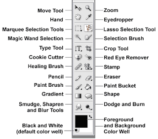
First, the Lasso Tool looks like this:


The first tool is the Lasso Tool and allows you to draw free form selections.
The second is the Polygonal Lasso Tool and this one allows you to draw selections, but they will consist of line segments.
The third is the Magnetic Lasso Tool and allows you to make selections based on the edges; almost as if you are tracing the edges.

The same selection tools available for the Marquee Tool are available for the Lasso Tools.  This allows you to add, subtract and change your selections.


One great tip for me helps with lines.. To Create straight lines hold down the ALT/OPT key as you draw the path. What this does is -- it toggles between the standard tool and the Polygonal Tool. Presto - straight line!  Woot!

What can the Lasso tools do for you?  Here are two easy things it may help out with:

Creating your own custom Shape:  
Create a new transparent layer by clicking the Create a New Layer icon in the Layers Panel, then you can click on the Polygonal Lasso tool. 

In the Menu Bar, set the Feather to 0 and choose the New Selection icon in the Options bar. (A Feather at 0 is a basic hard edge, while the higher the number, the softer the edge will be).

Click four times (or however many you need for your shape) on your new document to create the four corners of your shape and then double-click to close the shape.

Next, you will choose the Paint Bucket tool and click inside your shape to fill it with the foreground color.  Press Enter. 

Here is the Feather at 0, with the marching ants, and then filled with the Paint Bucket:


Here is the Feather at 5, with the marching ants, and then filled with the Pain Bucket.  As you can see... it really takes the hard edges off with just a little higher feather!  Play with the settings and find your perfect number! 


Press Ctrl D (Cmd D) to remove the selection.

You can use your new shape to clip papers or photos, or make and edge template!  

Many times you will get Alphas or even embellishments for kits on a single sheet.  This sometimes helps to see everything.  How do you move things from that sheet to your page... Here's how:

Alpha Full Pages:  Moving Single Letters

First, you need to open  the png Alpha file.
Select your Lasso tool (or your Marquee Tool -- whichever you prefer).
Click and draw your lasso around the letter you want to use in your layout.
Once selected, you should see the marching ants around it (meaning it is the active selection).
Choose the Move Tool and drag the letter onto your layout. It will be added on its own layer.
Repeat the steps for additional letters.


One Tip when moving letters... as with any moving in Photoshop:
If you want your letters to be centered on your layout, hold down the Shift key as you drag it from the png file to your layout. 


Hope you enjoyed my bits about the Lasso Tool!  On Tuesday, I will be sharing how to use the Lasso tool and removing a background from a photo!  Hope you come back to read it!

Have a great weekend!
Jenn
jk703


Read more...

Thursday, October 7, 2010

Saturday School: Tool Time

Hi Everyone! It's Jenn (jk703) here with your Saturday School: Tool Time! We covered the Move Tool last time, and today we will be looking at the Marquee Tool! A very versatile tool! Let's get right to it!

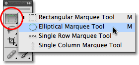
First, the marquee tool is on the tool bar and looks like this:


The Marquee Tool can be accessed by the shortcut Command + M or Control + M. At the most basic function, the Marquee tool is used for cutting, cropping and copying selections. As in the image above, there are 4 different ways to make selections: Rectangular, Elliptical, Single Ron or Single Column. The single Column or Single Row measurement is in pixels. Right now, you think you can only create selections using Rectangles and Ovals! Wait... we can fix that!

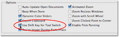
In your Photoshop Preferences selections menu, check off the Use Shift Key for Tool Switch option. This will allow you to create squares and perfect circles. When making your selection using the Rectangular Marquee, and holding down the shift, you will create a square selection. the same goes for the Elliptical marquee and circles.


There are times when you make a selection, and realize that it is not in the right location. Do you know how to move the selection? Here is how; hold dowm the space bar, and then begin to drag your mouse. Your selection will move and not re-size.

Now I will go over the marquee Options Toolbar. This will give you some knowledge of what all those little icons up on the top mean! And you thought they were decoration! HA! The toolbar option looks like this:


This bar allows you to make changes to the Marquee tool you are using, whether Rectangular or Elliptical. Those for funny square type shapes have meanings too! The first is called the New Selection Button. this allows you to make a new selection and delete the current selection.
The second small button is called the Add To Button. This option allows you to add to an existing selection. When you are making an additional selection you can also get to the Add On Option by pressing and holding the shift key while you are making the new added selection.

Subtracting from a selection is able to be completed by choosing the 3rd small button, and works in the same was as the Adding to the selection button. This button can be used by pressing the Alt Key on your keyboard, or for a Mac, the Option Key, and again this must be while you are making your selection.
Last but not least is the Intersection Button. This option can be used when you want to have an intersection area within the existing selections. By pressing and holding the Shift and Alt together (Shift and Option for Mac) you can do this while making your selection!


That is a lot to see and understand... So, I am blogging again on Tuesday the 12th.... I will be showing you how to make your own Vignette using the Marquee Tool! Woot!

Have a great day everyone and thanks for stopping by! I hope you come back for a visit on tuesday too!
Jenn (jk703)


Read more...

Saturday, September 25, 2010

Saturday School: Tool Time

Hi Everyone! Happy Saturday! This is Jenn and I am bringing you your Saturday School today! A couple of times a month, I will be blogging about the different tools that you find in Photoshop Elements and Photoshop. I want to show you what your tools can do for you!

This week's topic for tools is the Move Tool! I know, I know... you are thinking "The Move Tool?!" I know it isn't physics, or rocket science, but we have to start somewhere, right?! The Move Tool is the most basic tool, and there are some hidden secrets! Let's see if I can show you something that you didn't know!

The Tools:


The move tool is at the top of the tools toolbar and looks like a triangle and a small arrow that points to the left. I actually learned a few tricks about the Move tool that I thought I would share! Some are basic... but keep reading! Click on the Move tool, or you can also get there by hitting "V" for the keyboard short cut and we are off...

You can move entire layers. If you first click on the layer (within the layers palette) to activate it. Then click onto the canvas and move the layer around as you would like or simply nudge it here and there using the arrow keys. A nudge is a a single pixel move in the direction of the arrow you choose. By pressing the shift key and the arrow, your nudge becomes a 10 pixel nudge!

To make copies of any image on layer, press and hold Alt key and drag the image with move tool. This action duplicates the image by creating new layer over original image layer.

To copy an object in a straight line, click and drag the object while holding down the Shift and Control (Command on a Mac) keys together. The element will be copied and the copy placed in a line either vertically or horizontally from the original element.

To find center point of any image, select move tool and check the move tool option "Show Transform Controls" on option bar above.

You can use the Move Tool temporarily while you are using most of the other tools - just by holding down the Control Key (Command on a Mac).


The option to Automatically choose the Selection is very handy. By checking this item, it allows a selection that is clicked on within the canvas to be moved. The corresponding layer in the layers palette will also be highlighted and selected.


The option to Show the bounding Box is important to me! By choosing this option, a 9 point box will show up around your selection. By choosing one of those nine points, you can click and drag to enlarge or shrink the selection. In the center of your selection is a round point, by clicking and dragging this, you can skew the selection.

When the Bounding Box is selected and you press the Control + T (Command + T on a Mac) the move tool will then change to the the Transform Command.

To quickly change the opacity of a layer quickly while you are using the move tool, type the percentage opacity you want the layer to be. Typing an 8 will change the opacity to 80%, typing 1 plus a 5 will change it to 15% but to change the opacity to 100%, you can just type a zero.

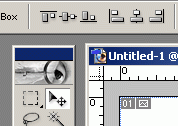
In the top of the bar that shows the Move Tools, within the sub tools, you should see this tool menu or something similar:
This part of the Move tool can be really, really useful! Aligning two layers together is all well and good, but we often find we want to align something to a specific layer. For instance, you might want to center a layer horizontally within another layer, or centering a frame on to a cropped background paper. Here's how:
  1. Control (or command) click on the icon in your layers palette. This makes the marching ants march around that particular selection.
  2. Select the layer you want to move. If you want to align more than one layer, link those layers to the selected layer:
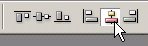
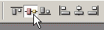
  3. Here is the two step click to center:
Click on this icon:
Then click on this icon:
Presto chango.... your selection is centered on the specific layer you chose! How cool is that?!?!. Now I hope that you have learned something in the above that might be useful and you enjoyed my rambling!

Enjoy the rest of your weekend, and leave me a comment on what Tool you want to see done next! Have a great day everyone!
Jenn (jk703)


Read more...

Saturday, July 3, 2010

Saturday School - Another Shadowing Technique

Happy Saturday! It's Kate here to show you another technique to make realistic drop shadows in Photoshop. If you missed the post on basic dropshadow techniques, just rewind to last Saturday and catch up before we start today's tutorial. Ready? Okay, this is what my layout looked like when I finished up last week...


Now I'd like to focus on the circle element on the left and it's shadow. What do you see?

The circle element's shadow is falling on the background paper, a ribbon that's layered onto the background paper and a paper mat that's layered over the ribbon. If the layout were made from real bits of paper and ribbon, the shadow would fall differently on all three layers, but it looks exactly the same. We're going to fix that.

The first thing we need to do is to separate the shadow from the element. To do that, highlight the layer and right click on the 'fx' symbol. Then choose 'create layer' from the menu (almost all the way at the bottom). Next duplicate the shadow layer twice. We now have the element and three drop shadows. You'll notice that the drop shadow looks much darker. That's okay for now. 

Now we're going to hide two of the shadow layers and erase the portions of the third that fall on the ribbon and paper mat. Ctrl-click on the box on the layer that has the frame to select it. You should see the 'marching ants' around the frame. Making sure that the shadow layer is selected, click 'delete' on the keyboard to erase the portion of the shadow falling on the paper mat. Repeating the process with the ribbon, our layout looks like this -
 

Now we're going to select the second shadow layer and move it slightly in the direction of the light, then erase the portion of the shadow falling on the background paper and the paper mat. We'll repeat the process with the third shadow layer, moving it closer to the light than the second shadow and erasing everything except the part of the shadow falling on the paper mat. Now the shadow looks much more realistic with the bigger shadow falling on the surface that is farthest away from it.

If you want to get look that's a bit more realistic, then make each drop shadow separately instead of simply duplicating the one and moving it. You can also adjust the darkness of the shadow - a closer shadow will usually be darker than one falling on a surface further away. This is what it looks like after I adjusted the middle shadow to an opacity of 84% and the bottom shadow to 47%.
 

The shadow looks even more realistic now. There are many other ways you can adjust drop shadows to achieve different effects... but they're the subject for another day. Thanks for stopping by and have a great Saturday!

Read more...

Saturday, June 26, 2010

Saturday School: Intro to Drop Shadows

Hi, it's Kate here to give you a quick lesson in drop shadows. Today I'll cover the basics and next week I'll talk about some neat things you can do to make your drop shadows look even more realistic. What is a drop shadow, you ask, and why would you want to use one? Pretend you're holding a traditional scrapbook with papers layered and photos and other embellishments. The pages aren't really flat, are they? Well, when you layer digital papers and elements on a page, it's totally flat. Drop shadows give the illusion of depth on the page.

Take a look at this layout I'm working on from my son Robert's 5th grade promotion celebration. I'm using one of Jennifer's Scraps to Go (Vol. 5) templates and her kit 'Raining on Sunday' and I've clipped the papers and my photos to some of the layers of the template which already had drop shadows. I've also added a few ribbons and paper circles where the ribbons and flowers were on the template. You can see that some of the layers have drop shadows and some don't. The layers with the drop shadows look more realistic than the ones without.


To add a drop shadow to a layer, highlight that layer then click the little 'fx' button on the bottom of the screen and choose 'drop shadow' from the menu.

When the menu comes up, you have to choose the settings and then click OK. In this case I used the same settings as the ribbon layer in Jennifer's template since she already figured out what would look best. One tip here is that you generally want all your shadows going the same direction on the page. I could explain all the options, but it would be easier and more fun for you to play with them and see what happens!

I'm only going to give you one more tip today, because I want to save more goodies for next week! I didn't actually go in and set all the options myself. Since the only layer style is the drop shadow, I went to the layer with the shadow I wanted and right-clicked on it, selecting 'copy layer style'. Then I went to my ribbon and right-clicked on it, selecting 'paste layer style'. Voila! A perfect drop shadow! Here's how my layout looks with the drop shadows added to all the layers. Well, almost all the layers. It would have looked funny if I put a drop shadow on the paint spatter.

Thanks for stopping by - and don't forget to come back next Saturday when I'll talk about ways to make the shadowing even more realistic!

Read more...

Tuesday, June 15, 2010

Tidbit Tuesday: Compliment It!

Hi, Kate here with a quick tip that will work in both Photoshop and PSE. To invert the color of your layer, or change it to it's complimentary color or colors, simply select the layer and click Ctrl-I. Voila! If the layer you invert has multiple colors or shades of gray (like a picture), you'll get an effect like a photo negative. How cool is that?

Read more...

Tuesday, June 8, 2010

Hard Drive Heaven

Hi everyone, Heather here to give you a bit of advice on external hard drives.


Last month I wrote up all about flash drives, so I thought a little information about their big brothers would be useful too.


Since we all use different types of computers lets get a few things straight first.


Mac vs PC
Yes they are different operating systems but a hard drive is a hard drive. It will back up differently depending on which you are using and how you are choosing to back it up, but for the better part all hard drives will work on all computers.


USB vs Firewire (1394)
This can hold one of the major differences between the two. All computers have USB ports, but only some (normally Macs) have Firewire ports (on a PC it is called a 1394). And even getting more confusing, depending on how old your Mac is, or which model you have there may be a Firewire 400 or 800 port. These are normally better (faster) than USBs, only in rare situations is USB 2.0 faster than Firewire 800. (But enough of this because Macs only come with Firewire 800 ports now.)


GB vs TB


A GigaByte (GB) is 1024 MegaBytes. A TetaByte is 1024 GigaBytes. (When formated, this is why hard drives seem a little bit smaller than what comes on the box)


So, lets take a look at some of my favorite hard drives.


Western Digital:


They have two (or four depending on how you look at it) pretty cool families of external hard drives. The My Book, My Passport, then a My Book Elite and a My Passport Elite.


The My Book is a stationary hard drive as it requires a power source, but the My Passport will generate power from the USB or Firewire port so it is more portable. They are all available as either USB only or USB / Firewire (more expensive) connections. They also come in all different sizes from 320 GB to 4 TB. The Elite models have a display on the outside of how much space is being taken up on the inside.


Seagate:


Similar to the Western Digital, these hard drives come in a portable and stationary model. All different sizes and you have the option to have a USB or USB / Firewire drive.


Lacie:


I love the Lacie Rugged drive. It has an awesome little grip around it and connects with USB and Firewire. These also come in multiple sizes.

I have also had an Iomega, Buffalo, Verbatum, and G Drive; but these are my top favorite three. I hope you have a little more information about hard drives and if you don't have one, will get one very soon! A rule that I like to live by is this: If your information does not exist in three locations, your information does not exist. All hard drives will fail one day, so keep more than one copy in case the worst happens. Also think about keeping one at a separate location in case you have a break-in, fire, or flood. Hopefully none of those, but a sticky note on your hard drive saying "Please don't take this robber" may not work (but I keep one on mine anyway, hey... a girl can dream, maybe the robber will have a little bit of a heart).

With all of this here is a little insight to my backup plan:

2 computers, one laptop, one desktop. Each has their own dedicated backup drive. One hard drive lives at my mom's house and gets backed up with the essentials about once a month. Contacts, calendars, bookmarks, photos, and email gets synced with MobileMe with both of my computers and iPhone. I also have a portable drive that I keep photos on so I don't have to keep them on a computer and I can switch between both computers. When one hard drive fills up, I buy a larger one, copy the old information to the new one, then take the full one to my mom's.

Now go back up!

:D


Read more...
Related Posts with Thumbnails

Disclaimer

As a creative team member for several digital scrapbook designers, I have received their products for free in return for creating and posting projects (digital layouts, hybrids projects, etc). Many of the layouts you see here were done in conjunction with requirements for these creative teams. Please be advised that the products used were indeed received for free.
The Daily Scrapper - Topsites Best Scrapbooking Sites, Digital Scrapbooking, Scrapbook Supplies, Reviews, Awards
List of the Best Digital Scrapbooking Websites by Scrapbook MAX!SCRAPBOOKING TOP 500 The Daily Scrapper - Topsites Free Digital Scrapbooking

  © Blogger templates Newspaper III by Ourblogtemplates.com 2008

Back to TOP