Saturday, April 16, 2011
Saturday, March 12, 2011
Alpha Outline: How To
Hi Everyone! Hope you are having a great Saturday! It's Jenn (jk703) here to share a little tutorial to add a little something to all those fonts you use on your layouts! I'm sure many of you are fontaholics just like me!
Many times on a layout, I will use an alpha for a main word in my title, and then use a font the other words that are in the title. BUT, there are also times when I just use fonts for my whole title. Outlining the font gives it a little oomph and makes it stand out a little. It can look like a sticker, or just give the font an different look.
For my example, I am using He's My Brother kit, and the font is called Smiley Monster, a free scrapbooking font by Kevin and Amanda. An awesome color palette, and lots of fun embellishments!
Ok... let's get started! You should have a layout open in PS or PSE.
Using the Type Tool, choose your font, and type in your title or the words that you will be outlining.
Double check the font, spelling, and placement to make sure it is how you want it to look.
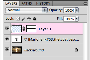
Next, you will right click on the Type Layer in the Layers Palette. Choose Rasterize layer or Simplify Layer, depending on your program.
In the File Menu, click on Edit > Stroke, and the Stroke menu will pop up.
I usually use anywhere between 2 and 8 pixels. If you want a larger stroke outline, you can always adjust the distance between letters to allow for more space.
Another way to change it up is to play with the stroke color, with different colors used to match my layout. In the Stroke menu, the Color box is clickable, and the Select Color Menu will pop up so you can choose any color you want.
Remember, you can play with all the settings here, to see what pops up. If you don't like what you did, click to undo! I first tried a brown outline as seen here.
Next, I tried teal, and last I tried White. White on white is nice, just add a shadow to really show off the edges as if it was a sticker.
There you have it... a nice outline to my title with a font! It looks like a sticker with the edge, and then the added shadow gives it some depth! Hope you enjoyed the tutorial! Thanks for visiting!
Enjoy the rest of your weekend!
Jenn (aka jk703 or The Typative Scrapper) Read more...
Saturday, March 5, 2011
Saturday School - Adding a Border to Photos
Adding a Border to Photos or Elements in PSE
Hey Everyone!! Michelle (aka mdel) here with a tutorial for y'all.
Have you ever wanted to add a border to a photo or element to help
give it a little pop? From time to time I find myself adding an
alpha to one of my layouts only to notice that it is getting
a bit lost on the page. Today I thought I'd share an easy tutorial for adding a border
around a photo, element or alpha.
Let's get started...
To begin, open Photoshop Elements and a photo. I currently use PSE 7.0 but I have used
this technique in PSE 5.0 as well. Make sure your layers palette is visible. If the
palette is not visible go to Window>Layers which will open the layers palette.
Next click on Layer>New>Layer from Background.
You can now give your photo layer a name (doesn't really matter what you choose)
and then click "ok" to close the dialogue box.
Hold down the Control (Ctrl) key and left click your mouse on the photo
layer icon in your layers palette. This will bring up what are referred to
as "marching ants" around the edge of your photo.
Click on Edit>Stroke (Outline) Selection
Once you do this your Stroke dialogue box will pop open. The width box controls
how wide your border will appear on your photo or element. (When adding a border to
a photo I usually use about a 25 px setting. If I am adding a border to an alpha or
element I may make it smaller.) If you click on the color box a window opens
that will allow you to select the color of border you want to use. For photos, I like white or
off white however for elements or alphas you may want to use a color matched to the kit.
I leave my Location checked as "Inside", keep the Blending Mode at Normal and leave the
Opacity at 100. Once this step is complete click "ok" to close the stroke dialogue box.
Upon clicking "ok" you should now see a border around your photo.
You may notice you still have the "marching ants" around your photo. To remove those
click Ctrl+D.
Hope you found this tutorial easy and informative. Happy Scrapping!!
Friday, February 25, 2011
Saturday School - Flipping Elements
- Place the element on your page.
- Select the element.
- Go to Edit > Transform. There are several options listed, including options to rotate or flip the selected layer. In this case, I selected Flip Horizontal to flip the arrow the opposite direction.
- Move the element to place it in any position on the page and you are done.
Saturday, February 19, 2011
Saturday School: Brush Tool Info
Hi Everyone! Hope your Saturday is going great! I'm here today to share more information about the Brush Tool in Photoshop.... but before I do...
Can you believe the news? Jennifer Fox Designs is now at 9th and Bloom!! Woot! How cool is that!? I hope you've stopped over there, checked out her goodies in the store! You might also want to stop here and see how you can win a chance to join the Creative Team for 3 months! Good Luck!
About the Brush Tool and the Options
First, you need to start a new document, layout or an existing project. You will select the Tool Brush from the tools toolbar. This is what the Brush Tool is, and what other tools are available.
The Options Palette on the top looks like the picture below... and is pretty easy to use. You can change the size of the brush, as well as play with the hardness of the brush that you will use. When you change the number of pixels of a brush, you are changing the Hardness. A higher number on the Hardness slider will make the edges on your brush more defined. A lower number on the Hardness slider will make the edges on your brush less defined.
On the Options palette you can choose the Mode that you want the brush to have, the actual stroke. The Opacity percentage will change the opacity of the brush stroke. Lowering the percentage will make the brush stroke more transparent, while raising the percentage will make it less transparent.
There is also a button for Flow. This allows you to select how much paint will come out of the brush when applied to your document. The higher the flow, the more paint, as well as the lower the flow, the less paint used when you click your mouse.
There is also an Airbrush feature available. This allows paint to come out of the brush the whole time you are moving your mouse.
- Brush Tip Shape -- determines the main shape of the brush.
- Shape Dynamics -- allows you to modify the shape of the brush.
- Scattering -- this option determines how closely the brush marks are to the stroke. This can add a nice randomness to your stroke.
- Texture -- Adding a texture to your brush can really show some depth. Photoshop allows you to apply any of your Texture presets to your brush.
- Dual Brush -- Combining two different brushes using the Dual Brush option can really create some fantastic effects - unavailable if you were only using one brush.
- Color Dynamics -- this option allows for modification of the color of the stroke. Playing with this will allow you to create some interesting color variations.
- Noise -- Creates random noise within your brush shape.
- Wet Edges -- If you keep the edges of your brush at the highest opacity, and lowering the inside of your brush's opacity will create a similar look to watercolor, hence the Wet Edges.
- Airbrush -- works with Flow, that is on the Menu bar above.
- Smoothing -- Smoothes the curves of the stroke.
- Protect Texture -- This can allow you to make sure the same texture is used for every brush with a texture.
- B -- Brush Tool
- Shift + B -- Rotate through Brush tools (i.e. Brush, Pencil, etc)
- F5 -- Show or hide Brushes palette
- [ -- Decrease brush diameter
- ] -- Increase brush diameter
- Shift + [ -- Decrease brush hardness by 25%
- Shift + ] -- Increase brush hardness by 25%
- , -- Previous brush
- . -- Next brush
- Option (hold) -- Temporarily switch to Eyedropper tool
- Shift + Option (hold) -- Temporarily switch to Color Sampler tool
- Command (hold) -- Temporarily switch to Move tool
- Command + Option (hold) -- Duplicate and Drag layer
- Space (hold) -- Temporarily switch to Hand tool
Thanks for visiting!
Wednesday, February 16, 2011
MCP Photo Actions
Hi everyone, Terra here to share one of my favorite places for Photography Actions with you. I have a little bit of an obsession with Actions at the moment and one of my favorite sites is MCP Actions. I am not a Photoshop expert but I just love how easy it is to transform a photo with a good action, and MCP Actions are some of the best. The site also offers additional training and tutorials and is a great reference for anyone interested in improving their photos. There are several free actions on the site if you are just starting out. The latest freebie is the Mini Fusion Photoshop action, available for Photoshop and Photoshop Elements. With just one click, you can change the colors in your photo from dull to vibrant. It is highly customizable and a lot of fun to play with. So if you love actions or are just hearing about them for the first time, make sure you visit the MCP Actions website. I hope you'll like it as much as I do.
Read more...Saturday, February 5, 2011
Saturday School: Watermarking
Hi Everyone! It's Jenn (jk703) here to bring you this edition of Saturday School! Woot! How is your weekend going! I hope well! Since I've started digital scrapbooking, I've noticed that I'm really getting into my cameras, photo actions and the actual editing of my pictures! I like to take different shots, fun angles, and try out the different settings on my camera!
Since we have so many photographs we are posting to show-off online, like the popular P365 challenge or a even a single picture challenge in the digital scrapping forums, there may be times that you want to protect your photographic work! What I mean about protections is trying to disable people who might want to use them without your permission. Today, many photo sites that you are uploading your photos too also provide options for protecting your work. They offer an option to disable the "Right Click Feature" is really a helpful tool! One that is available to us, and easy to do ourselves is Watermarking!
Watermarking has it's good and bad points, but it is your decision. Here is a quick list of pros and cons.
No Watermark:
- Watermarks sometimes are considered annoying and distracting to the image.
- If someone wants to “steal” the image, they can likely remove the watermark anyway.
- The image may not hold specific value and you just want to share it.
- A watermark is a notification that the image is protected under a copyright.
- Watermarking is part of showing your brand.
- If someone does take the image and forward it to someone else, they will see it and may go to your site based on your watermark.
- There is also a notion that adding a watermark makes you appear professional. (That is more of an opinion).
How to Add a Text Watermark in Photoshop:
Open the photo you wish to protect.
- The Windows keyboard shortcut for the copyright (©) symbol is Alt+0169 (use the numeric keypad to type the numbers). The Mac shortcut is Option-G.
- Remember to click on the Color Swatch and set the color to 50% gray or another color of your choosing.
- Take the time to resize and place the text where you desire.
- Save the watermark as it's own file or png to use it over and over again!
Saturday, January 29, 2011
Saturday School: Basically Brushes
Hi everyone out in digiland! Happy Saturday! It's Jenn (jk703) here to share a little information with you. Are you too cool for school? (a Pink song, Raise Your Glass!) *giggles*
Now... I am into digital scrapping for just under a year; when I learn about tools or tips in Photoshop, I share them with you! So.... I am going to do a tut about brushes, but I need to learn more and practice!! This is such a fantastic part of Photoshop, that I wanted to share a few tips first... then when I've got the next Saturday, I will post more that I've learned about the Tool itself!
Brushes can make some really cool effects on your pages! It is an intricate tool, but one that you will love once you learn the basics! I know I'm starting to LOVE it!
- It is a basic painting tool.
- It uses a traditional painting manner by applying color with strokes.
- The Keyboard shortcut is B.
- The brush tip is the basic way to modify and change your strokes.
- Select the Brush tool and click on the brush picker dropdown from the Options bar.
- In the brush picker window, look on the right side for a small arrow or double-arrow, click that and the flyout menu will appear.
- Select Load Brushes.
- In the window that pops up, navigate to the folder where you unzipped the brush files. I keep mine in a file called: Brushes. So original, right?!
- Find the brush (you are looking for an .abr file) you put there, click on it, then click the Load button.
- That should load the new brush into your brush picker. If you can't find the brushes - look to the bottom.
- Create a new layer. Always do this, so what you do can be undone!
- Select the brush tool. C
- Choose the brush shape you wish to use.
- Set your foreground color. Important to do this NOW! :)
- Position the cursor (now the shape of the brush) and click to "stamp" the shape once or click + drag to make a "stroke" with the brush.
- You can make your brush larger or smaller with the [ and ] keys. Yes, brackets.
- To paint in a straight line, click on your start point, hold the shift key, then click on your end point. Funny tip..... click, hold the shift and just keep clicking and your straight lines will be connected. I made the "house" doing this! LOL!
- Try adjusting the opacity or blending modes of your brush layer to create unique backgrounds or watermarks for your layout.
- Always create your brushwork on a new transparent layer. This will also allow you to play with the blending mode or color of the brushwork easily.
- Scroll through all of the loaded brushes using the arrow keys on your keyboard. Select the Brush Tool and hover your cursor over your layout, you should see the outline of the brush. Use the right arrow to scroll, and left to scroll back. When you find the perfect brush, click once on your layout to apply the brush to the layer.
- Text: This will only display the name of the brushes. I need some visuals personally!
- Small Thumbnail: This displays shows small thumbnails of the brushes and then brush size just below it. (This is what mine is on for the tut -- you see a little more).
- Large Thumbnail: This displays shows a larger thumbnail of the brushes as well as the brush size.
- Small List: This displays the size of the brush followed by the brush name. There is a teeny-small preview. I can hardly make out much of what I see!
- Large List: This displays a larger preview, followed by the size of the brush and the brush name. Easier on the eyes!
- Stroke Thumbnail: This view displays the thumbnail, with the size of the brush beneath it. To the right, it shows you what the brush will look like when you paint with it (fantastic!)